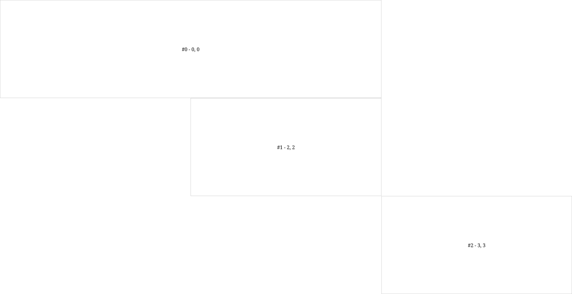
我try 创建一个具有可配置项的网格系统来设置位置和大小. 问题是,高度/宽度设置对网格项目没有影响.它们保持与1x1相同的大小,第一项不占用2x1:
const items = [{
    x: 0,
    y: 0,
    w: 2,
    h: 1
}, {
    x: 2,
    y: 2,
    w: 1,
    h: 1
}, {
    x: 3,
    y: 3,
    w: 1,
    h: 1
}];


document.addEventListener("DOMContentLoaded", () => {

    let numCols = 3;
    let numRows = 3;

    let gridContainer = document.getElementById("grid-container");


    gridContainer.style.gridTemplateColumns = `repeat(${numCols}, 1fr)`;
    gridContainer.style.gridTemplateRows = `repeat(${numRows}, 1fr)`;


    items.forEach((obj, i) => {

        let elem = document.createElement("div");

        elem.classList.add("grid-item");
        elem.textContent = `#${i} - ${obj.x}, ${obj.y}`;

        // Set the position dynamically
        elem.style.gridRow = `${obj.x} / span ${obj.w}`;
        elem.style.gridColumn = `${obj.y} / span ${obj.h}`;

        gridContainer.appendChild(elem);

    });

});
body, html {
height: 100%;
margin: 0;
overflow: hidden;
}
#grid-container {
display: grid;
height: 100vh;
/*gap: 1px; /* Optional: Add gap between grid items */
}
.grid-item {
border: 1px solid #ccc;
display: flex;
align-items: center;
justify-content: center;
}<!DOCTYPE html>
<html lang="en">
<head>
<meta charset="UTF-8">
<meta name="viewport" content="width=device-width, initial-scale=1.0">
<link rel="stylesheet" href="style.css">
<title>Full-Height Grid System</title>
</head>
<body>
<div id="grid-container"></div>
<script src="script.js"></script>
</body>
</html>为什么忽略第一个元素的宽度设置?
Actual result:
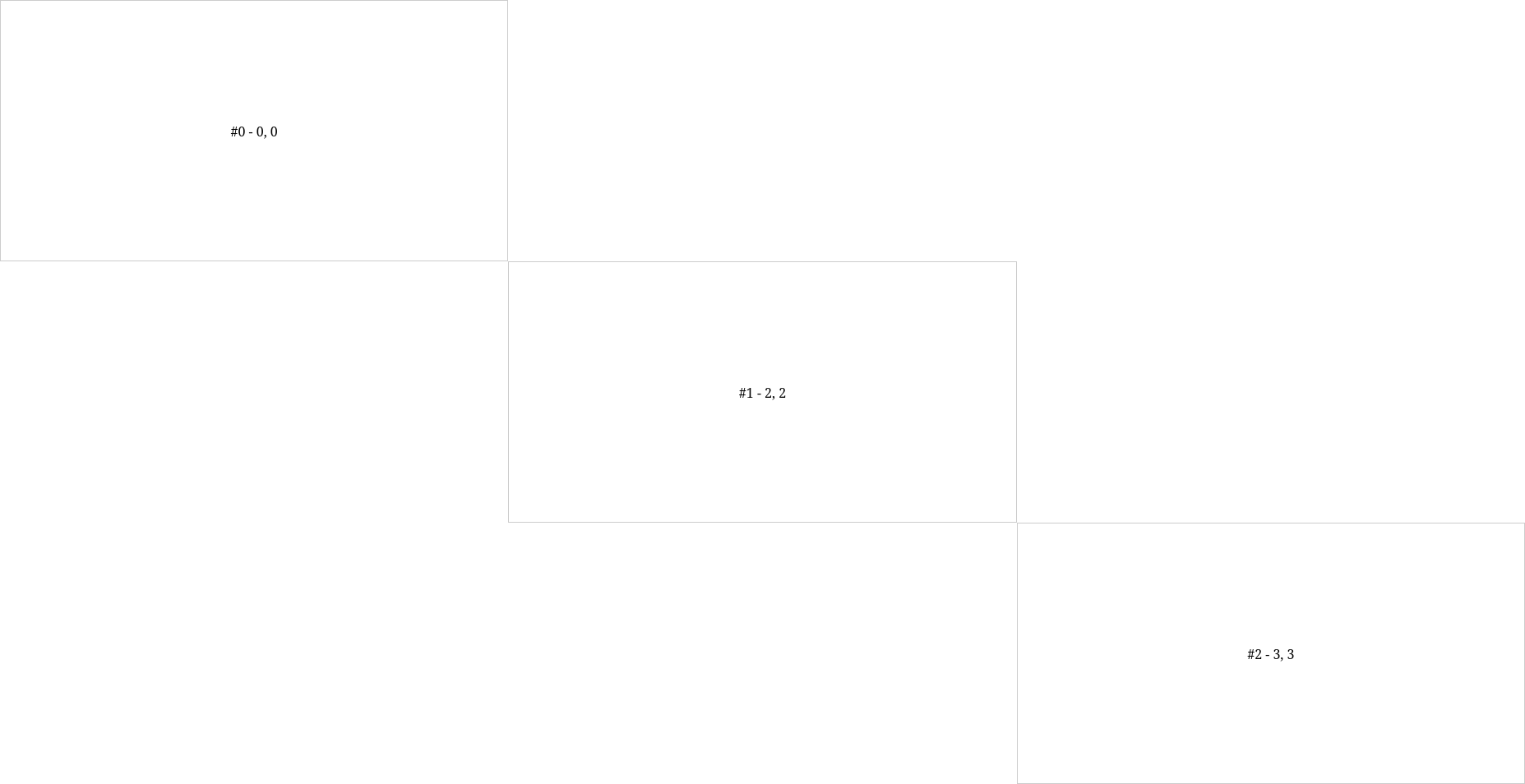
Wanted result: