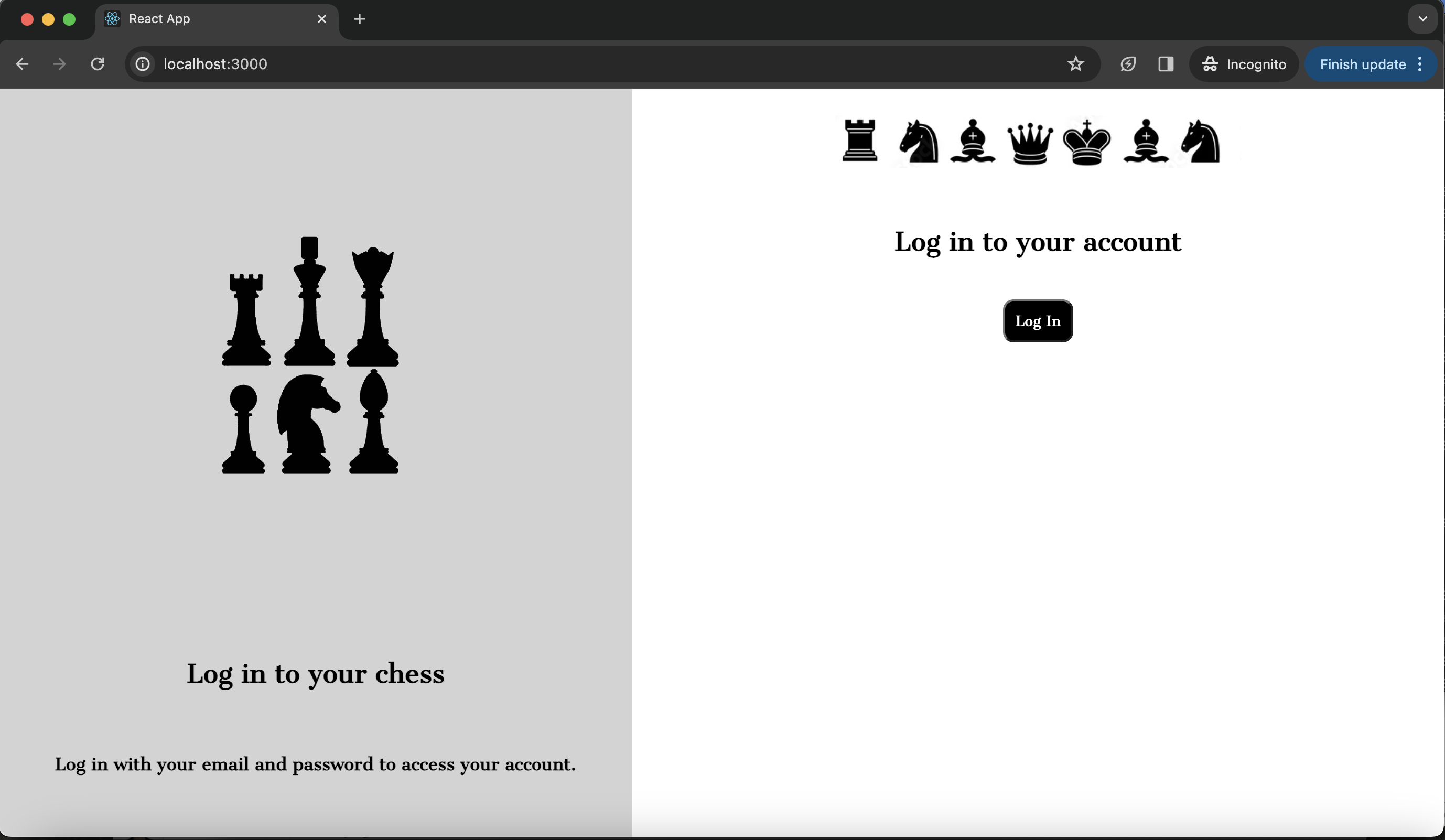
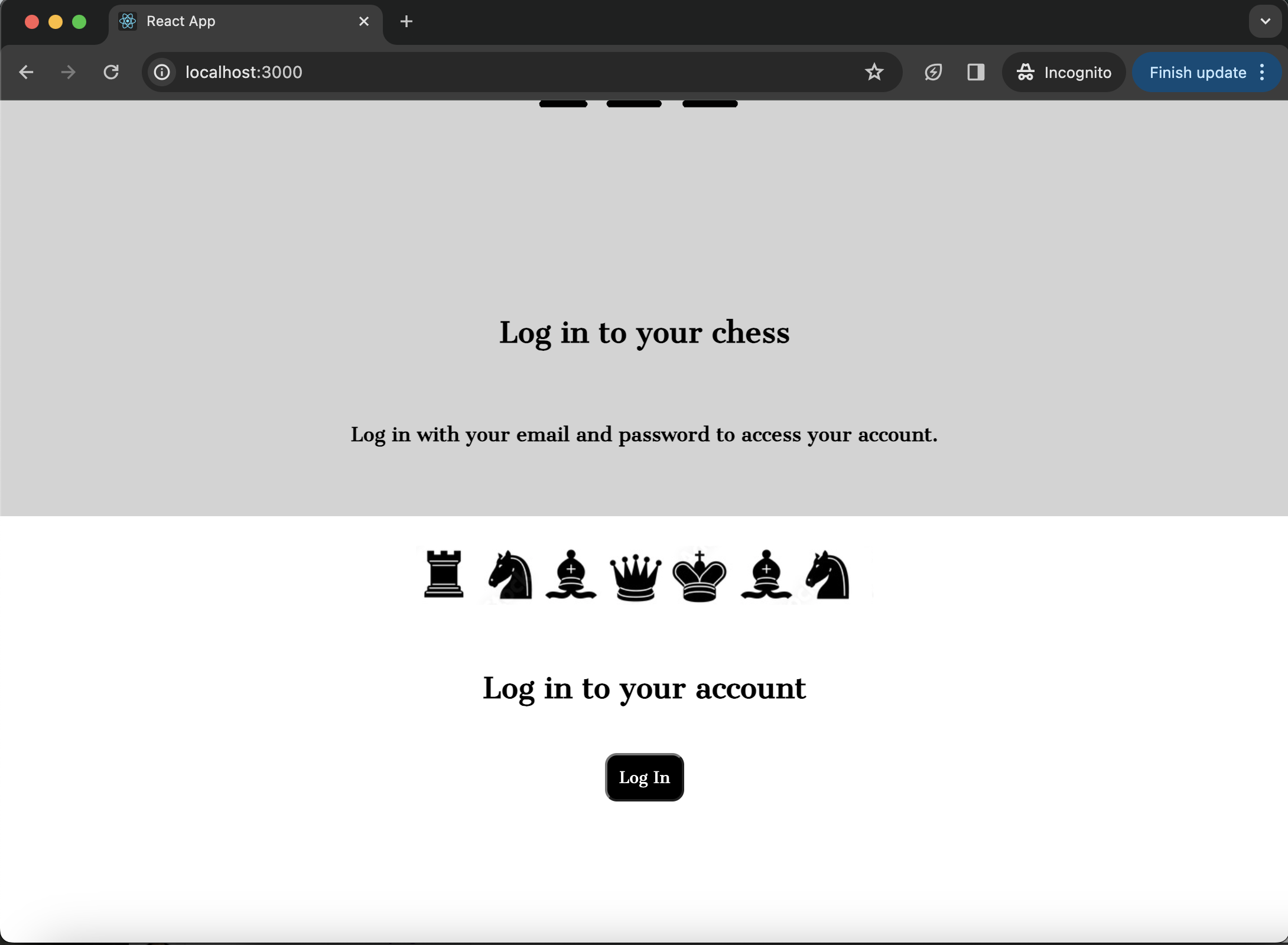
我正试图建立一个登录页面,被分成两列(目前尚未完成).每一列都包含一个图像和文本.当窗口是全尺寸时,它显示得非常好,但如果窗口小于这个大小,页面就不再显示为两列.我希望页面显示为两列而不考虑窗口大小,并使图像与窗口一起缩小和增长,以便它们保持成比例.我try 过使用max-Height和max-Width,但这两种方法都没有解决这个问题.但是,当我删除图像或try 使用完全正方形的图像时,此问题不会发生,并且列会随着窗口大小的调整正确地调整自身的大小.请看下面的截图和代码.
.center-img-half {
  display: flex;
  align-items: center;
  justify-content: center;
  scale: 50%;
}

.center-div {
  display: flex;
  align-items: center;
  justify-content: center;
  padding: 10px;
  text-align: center;
}

.black-white-button {
  background-color: black;
  color: white;
  border-radius: 10px;
  font-family: 'Cantata One', serif;
  padding: 10px;
}

.wrapper {
  background-color: white;
}

.login-column1 {
  background-color: lightgray;
  display: flex;
  flex-direction: column;
  flex-basis: 100%;
  flex: 1;
  height: 100vh;
}

.login-column2 {
  background-color: white;
  display: flex;
  flex-direction: column;
  flex-basis: 100%;
  flex: 1;
  height: 100vh;
}

.row {
  display: flex;
  flex-direction: row;
  flex-wrap: wrap;
  width: 100%;
}
<div class="wrapper">
<div class="row">
<div class="login-column1">
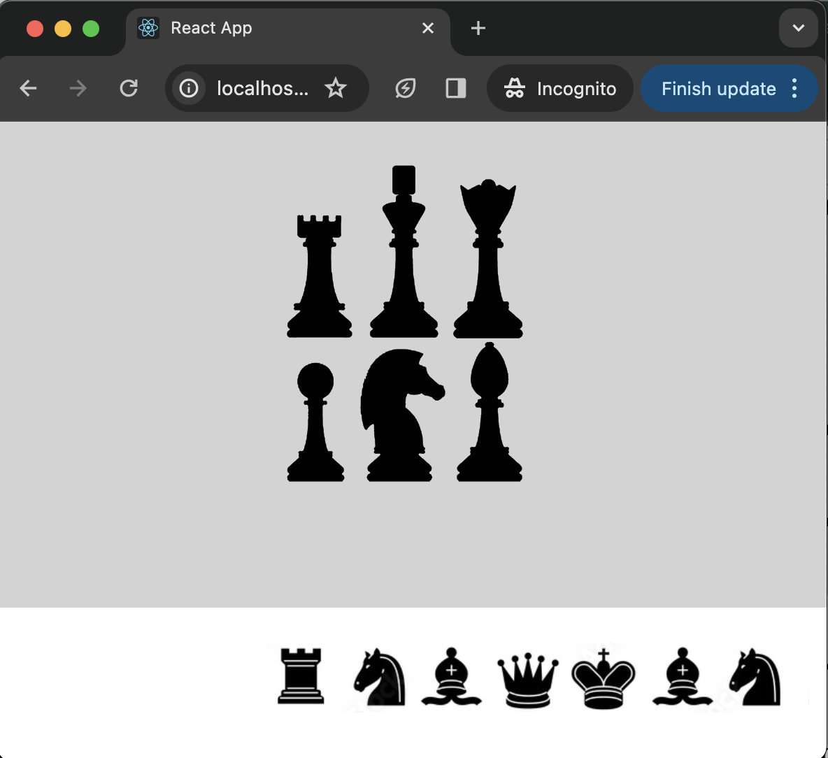
<div class="center-img-half">
<img src="https://via.placeholder.com/300x300" />
</div>
<div class="center-div">
<h2>Log in to your chess </h2>
</div>
<div class="center-div">
<h4>Log in with your email and password to access your account.</h4>
</div>
</div>
<div class="login-column2">
<div class="center-img-half">
<img src="https://via.placeholder.com/600x200" alt="Chess Pal Logo" />
</div>
<div class="center-div">
<h2> Log in to your account </h2>
</div>
<div class="center-div">
<Button class="black-white-button">Log In</Button>
</div>
</div>
</div>
</div>