我有一个问题,当我的网站调整大小时,我的网站标题在图片横幅下消失了,对于我的生活,我找不到原因!

似乎我错过了一些css风格可能,我不确定.

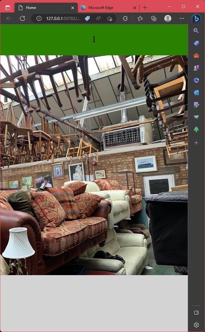
标题是一个带有左右两列的div,当调整屏幕大小时,这些列会堆叠在一起.

HTML

<!doctype html>
<html>
<head>
<meta charset="utf-8">
<title>Home</title>
<link href="assets/css/styles.css" rel="stylesheet" type="text/css">
</head>
<body>
<header><div class="head-container">
    <div class="head-item-left">1</div>
    <div class="head-item-right">2</div>
    </div>
    </header>
    <div class"top-banner-holder"> 
        <div><img src="images/Southend Furniture Warehouse Store.jpg" class="top-banner-pic" alt="" /></div>
    </div>
    
</body>
</html>

CSS:

@charset "utf-8";
/* CSS Document */
/* Add this as properties to a selector */
body {
  margin: 0;
  width: 100%;
  background-color: lightgrey;
}
* {
  box-sizing: border-box;
}
/* Header style */
.head-container {
  display: flex;
  flex-direction: row;
  font-size: 30px;
  text-align: center;
  height: 100px;
  z-index: 1000;
}

.head-item-left {
  background-color: green;
  padding: 30px;
  flex: 50%;
}

.head-item-right {
  background-color: green;
  padding: 30px;
  flex: 50%;
}

/* Responsive layout - makes a one column-layout instead of two-column layout */
@media (max-width: 800px) {
  .head-container {
    flex-direction: column;
  }
    }
.top-banner-pic {
    width:  100%;
    height: 715px;
    object-fit: cover;
    object-position: 80% 100%;
            
}

Example

推荐答案

以下是更正后的带有完整的css代码的HTML代码:

body {
  margin: 0;
  width: 100%;
  background-color: lightgrey;
}

* {
  box-sizing: border-box;
}

.head-container {
  display: flex;
  flex-direction: row;
  font-size: 30px;
  text-align: center;
  height: 100px;
  z-index: 1000;
}

.head-item-left {
  background-color: green;
  padding: 30px;
  flex: 50%;
}

.head-item-right {
  background-color: green;
  padding: 30px;
  flex: 50%;
}

@media (max-width: 800px) {
  .head-container {
    flex-direction: column;
  }
}

.top-banner-holder {
  position: relative; 
}

.top-banner-pic {
  width:  100%;
  height: 715px;
  object-fit: cover;
  object-position: 80% 100%;   
}
<!doctype html>
<html>
<head>
<meta charset="utf-8">
<title>Home</title>
<link href="assets/css/styles.css" rel="stylesheet" type="text/css">
</head>
<body>
  <header>
    <div class="head-container">
      <div class="head-item-left">1</div>
      <div class="head-item-right">2</div>
    </div>
  </header>
  <div class="top-banner-holder"> 
    <div><img src="images/Southend Furniture Warehouse Store.jpg" class="top-banner-pic" alt="" /></div>
  </div>
</body>
</html>

Html相关问答推荐

我已经在我的网站上创建了按钮,但我不能让它们正确排列.'

试图让三个Divs与下面的另外三个对齐

放大缩小标题在外面的图像

需要关于HTML的建议

天使17:令人惊叹的动画

如何更改计时器S输入的Angular 字体大小?

如何翻转卡片图像的背面

轨道上的居中范围滑块拇指(Webkit)

如何显示自定义按钮以将产品添加到WooCommerce购物车?

来自元标记的响应文本

在屏幕上每行 css 中的特定列居中

当多个a元素用作目标时的:target伪类

将箭头图标添加到工具提示包装器时遇到问题

Bootstrap 轮播内容在箭头之间不显示

在 iPhone 上分隔 HTML 邮箱输入中的多个邮箱条目

使用 rgba() 的 css 中的边框不透明度不起作用

使用模板循环每行列出 3 个 bootstrap 卡

每次按下按钮时减小字体大小的 jquery 函数

如何使用 css 将图像变成黑色并使文本出现在悬停时?

使用 htmloutput 在shiny 的应用程序中呈现文本