我想建立一个与谷歌应用程序脚本,主要是在其移动版本中使用的网络应用程序,所以与较小的屏幕.我使用Bootstrap 5作为布局/网格系统.这些组件应该跨越移动设备屏幕的宽度,因此在Bootstraps网格系统中为col-12.
我返回的简单的Google Apps脚本文件是这样的:
function doGet(e) {
    return HtmlService
        .createHtmlOutputFromFile('my-form')
        .addMetaTag('viewport', 'width=device-width, initial-scale=1');
}
因此,我使用addMetaTag来配置这里建议的视区:Apps Script Web App elements are too small when viewed on a phone
这是我的Web应用程序的HTML文件(my-form.html):
<!DOCTYPE html>
<html lang="en">
<head>
    <link rel="stylesheet" href="https://cdn.jsdelivr.net/npm/bootstrap@5.2.3/dist/css/bootstrap.min.css" integrity="sha384-rbsA2VBKQhggwzxH7pPCaAqO46MgnOM80zW1RWuH61DGLwZJEdK2Kadq2F9CUG65" crossorigin="anonymous">
    <link rel="stylesheet" href="https://cdn.jsdelivr.net/npm/bootstrap-icons@1.10.2/font/bootstrap-icons.css">
    <meta charset="UTF-8">
    <meta name="viewport" content="width=device-width, initial-scale=1.0">
    <title>Med-Form</title>
</head>
<body>

    <div class="container">
        <div class="row">
            <div class="col-12 col-lg-8 offset-lg-2" style="background-color: lightgrey;">
                <header>A header</header>
            </div>
        </div>

        <div class="row mt-3">
            <div class="col-12 col-lg-8 offset-lg-2">

                <form>
                    <div class="mb-3">
                        <label for="exampleInputEmail1" class="form-label">Email address</label>
                        <input type="email" class="form-control" id="exampleInputEmail1" aria-describedby="emailHelp">
                        <div id="emailHelp" class="form-text">We'll never share your email with anyone else.</div>
                    </div>
                    <div class="mb-3">
                        <label for="exampleInputPassword1" class="form-label">Password</label>
                        <input type="password" class="form-control" id="exampleInputPassword1">
                    </div>
                    <div class="mb-3 form-check">
                        <input type="checkbox" class="form-check-input" id="exampleCheck1">
                        <label class="form-check-label" for="exampleCheck1">Check me out</label>
                    </div>
                    <button type="submit" class="btn btn-primary">Submit</button>
                </form>

            </div>
        </div>
    </div>

</body>
</html>
这是一个相当简单的Web表单(实际上,该表单只是Bootstraps文档中的一个示例代码).
使用Chome dev工具和一个较小的屏幕设备,HTML文件本身看起来(正确地)如下:

但是,作为Google Apps脚本Web应用程序部署,同样使用Chrome开发工具,布局不同:

谷歌在网页应用程序的顶部插入了一个警告横幅.如果我手动删除该行(它位于表格的一行中),如下面的屏幕截图所示,布局将与其移动布局(上面的第一个屏幕截图)匹配.
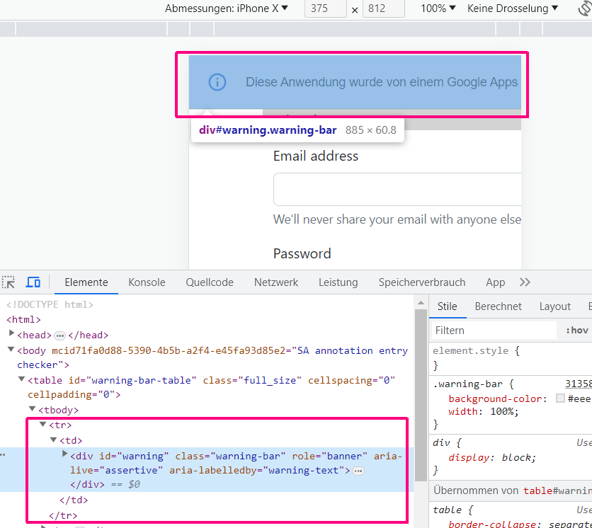
因此,似乎警告横幅是移动版本的Web应用程序无法正确显示的原因.但据我所知,现在有办法隐藏这条警告横幅.
我必须做什么,才能在小屏幕设备上正确显示我的Web应用程序?
非常感谢你的帮助!