有没有办法通过纯HTML/CSS来做到这一点?这就是我想要实现的:
|---------------------------| <-- start of screen
|          header           |   fixed height
|---------------------------|
|                           |
|                           |
|          content          |   fill screen
|                           |
|                           |
|---------------------------| <-- end of screen
|          footer           |   auto
|---------------------------|
我看到了一些东西,但没有回答我的问题:
CSS grid let an item take the rest of available screen space个
How to make CSS Grid with fixed header and footer with remainder in middle个
How to make CSS Grid items take up remaining space?个
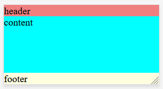
Here's what I have so far (image)个
body {
    width: 100%;
    min-height: 100%;
    margin: 0 0 0 0;
    background-color: gray;
}

.app-wrapper {
    display: grid;
    grid-template-columns: repeat(4, 1fr);
    grid-template-rows: auto 1fr auto;
    grid-template-areas:
        "header header header header"
        "contnt contnt contnt contnt"
        "footer footer footer footer"
    ;

    height: 100vh;
    width: 100%;
}

.header {
    grid-area: header;
    background-color: lightcoral;
}

.content {
    grid-area: contnt;
    background-color: aqua;
}

.footer {
    grid-area: footer;
    background-color: lightyellow;
}
<body>
<div class="app-wrapper">
<div class="header">
header
</div>
<div class="content">
content
</div>
<div class="footer">
footer
</div>
</div>
</body>