我正在使用Bootstrap 5创建一个网站,当有人将鼠标悬停在导航栏中的导航链接下时,我试图在导航链接下创建下划线,但我当前的代码仅在"服务"导航链接下创建下划线
这就是它看起来的样子 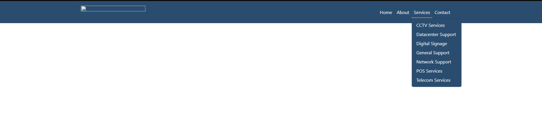
当你将鼠标悬停在其他导航链接上时,比如"主页"导航链接,它会在整个导航栏上加下划线.
这就是它看起来的样子 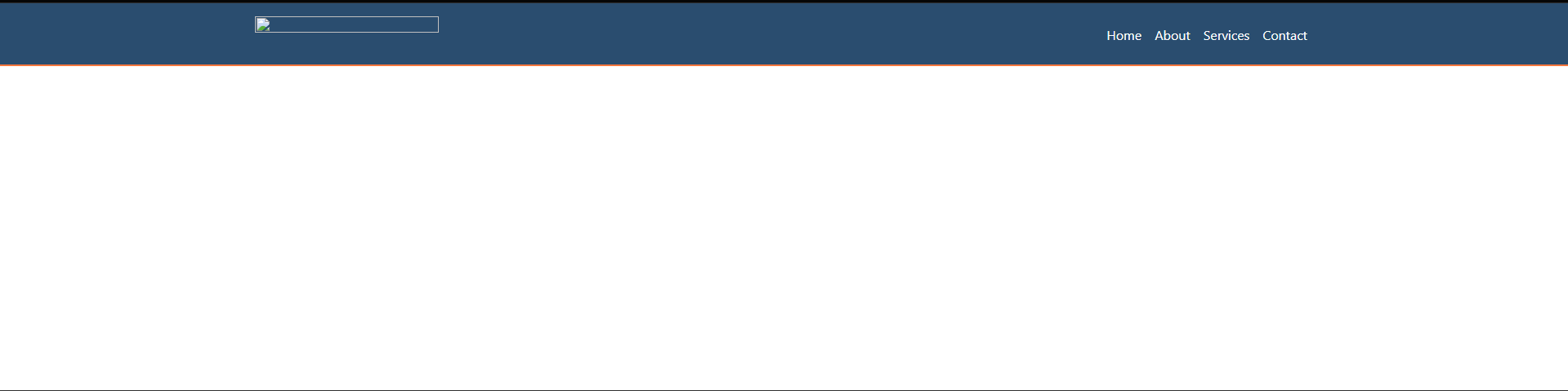
Test.html
<!doctype html>
<html lang="en">
  <head>
    <meta charset="utf-8" />
<meta name="viewport" content="width=device-width, initial-scale=1.0" />

<title>About | </title>

<!-- <meta name="description" content="Write an awesome description for your new site here. It will appear in your document head meta (for Google search results) and in your feed.xml site description." /> -->

<!-- <link rel="stylesheet" href="/_bridgetown/static/css/main.c7d4dd3f1984a290e9be.css" /> -->
<link href="https://cdn.jsdelivr.net/npm/bootstrap@5.3.0/dist/css/bootstrap.min.css" rel="stylesheet">
<link rel="stylesheet"
href="https://cdnjs.cloudflare.com/ajax/libs/font-awesome/6.4.0/css/all.min.css">
<link rel="stylesheet"
href="https://cdnjs.cloudflare.com/ajax/libs/font-awesome/6.4.0/css/all.min.css">
<link rel="stylesheet" href="/css/index.css" />
<link rel="stylesheet" href="./css/about.css" />
<link rel="stylesheet" href="https://cdn.jsdelivr.net/npm/bootstrap@5.2.3/dist/css/bootstrap.min.css" integrity="sha384-rbsA2VBKQhggwzxH7pPCaAqO46MgnOM80zW1RWuH61DGLwZJEdK2Kadq2F9CUG65" crossorigin="anonymous">
<link rel="icon" type="image/x-icon" href="/Bootstrap-/images/favicon-32x32.png">
<script src="https://cdn.jsdelivr.net/npm/bootstrap@5.3.0/dist/js/bootstrap.bundle.min.js"></script>
<!-- <script src="/_bridgetown/static/js/main.96ffffaea92690057bfb.js" defer></script> -->
  </head>
  <body>
        <!-- NAVIGATION BAR START -->
    <nav class="navbar navbar-expand-lg navbar-light  py-3 sticky-top" id="navbar-color">
        <div class="container">
        <a href="/Bootstrap-/index.html">
            <img src="./src/img/logo-topnav.png"  height="45" width="225" class="img-fluid"/>
        </a>

        <!-- TOGGLE MENU START -->
        <button
            title="Toggle Menu"
            type="button"
            class="navbar-toggler"
            data-bs-toggle="collapse"
            data-bs-target="#navmenu"
        >
            <span class="navbar-toggler-icon">
        </button>
        <!-- TOGGLE MENU CLOSE -->

        <!-- TOGGLE MENU START -->
        <div class="collapse navbar-collapse" id="navmenu">
            <ul class="navbar-nav ms-auto">
            <li class="nav-item"><a href="/Bootstrap-/index.html" class="nav-link text-white">Home</a></li>
            <li class="nav-item"><a href="/Bootstrap-/about.html" class="nav-link text-white">About</a></li>
            <li class="nav-item dropdown" id="dropdown">
              <a class="nav-link text-white" href="/Bootstrap-/services.html" role="button"  aria-expanded="false" id="servicesDropdown">
              Services
              </a>
              <ul class="dropdown-menu">
              <!-- <li><a class="dropdown-item" href="#">Action</a></li>
              <li><a class="dropdown-item" href="#">Another action</a></li> -->
              <!-- <li><hr class="dropdown-divider"></li> -->
              <li><a class="dropdown-item text-capitalize text-white" href="/Bootstrap-/cctv.html">CCTV Services</a></li>
              <li><a class="dropdown-item text-white text-capitalize" href="/Bootstrap-/datacenter.html">Datacenter Support</a></li>
              <li><a class="dropdown-item text-white text-capitalize" href="/Bootstrap-/digital-signage.html">Digital Signage</a></li>
              <li><a class="dropdown-item text-white text-capitalize" href="/Bootstrap-/gen-support.html">General Support</a></li>
              <li><a class="dropdown-item text-white text-capitalize" href="/Bootstrap-/net-support.html">Network Support</a></li>
              <li><a class="dropdown-item text-white text-capitalize" href="/Bootstrap-/pos.html">POS Services</a></li>
              <li><a class="dropdown-item text-white text-capitalize" href="/Bootstrap-/telecom.html">Telecom Services</a></li>

              </ul>
            </li>
            <li class="nav-item"><a href="/Bootstrap-/contact.html" class="nav-link text-white">Contact</a></li>

            <script>
                // Get the Services dropdown link element
                const servicesDropdown = document.getElementById('servicesDropdown');

                // Redirect to the services page when the dropdown link is clicked
                servicesDropdown.addEventListener('click', function(event) {
                  event.preventDefault(); // Prevent default link behavior
                  window.location.href = this.getAttribute('href');
                });

                // Add the hover effect on desktop devices
                if (window.matchMedia('(min-width: 576px)').matches) {
                  // When the mouse enters the dropdown link, show the dropdown menu
                  servicesDropdown.addEventListener('mouseenter', function() {
                    this.setAttribute('aria-expanded', 'true');
                    this.nextElementSibling.classList.add('show');
                  });

                  // When the mouse leaves the dropdown link or the dropdown menu, hide the dropdown menu
                  servicesDropdown.addEventListener('mouseleave', function() {
                    this.setAttribute('aria-expanded', 'false');
                    this.nextElementSibling.classList.remove('show');
                  });
                }
              </script>
            <!-- TOGGLE MENU CLOSE -->
        </div>

    </nav>
        <!-- NAVIGATION BAR CLOSE -->

  </body>
</html>
Test.css
@import "./.fonts.css";

:root {
    --desktop: 1200px;
    --laptop: 992px;
    --tablet: 768px;
    --mobile: 576px;
    }

body {
    background: hsl(233, 47%, 96%);
    font-family: 'Montserrat', sans-serif;
}

#copyright {
    border-top: 1px solid hsl(0, 0%, 20%) ;
}

.c-item {
    height: 900px;
}

.c-img {
    height: 100%;
    object-fit: cover;
    filter: brightness(0.6);
}

#team-img {
    height: 100%;
    object-fit: cover;
}
.dropdown:hover .dropdown-menu {
    display: block;
    background-color: hsl(210, 45%, 30%);
}

.dropdown-item:hover {
    background-color: hsl(210, 55%, 41%);
}

h3:after {
    background: none repeat scroll 0 0 hsl(210, 55%, 41%);
    bottom: -10px;
    content: "";
    display: block;
    height: 2px;
    position: relative;
    width: 100px;
 }

 h3 {
    font-weight: 300;
 }


#sub-header {
    color: hsl(18, 100%, 62%);
}

#navbar-color {
    background-color: hsl(210, 45%, 30%);
}

.navbar-light .navbar-toggler-icon {
    background-image: url("data:image/svg+xml,%3csvg xmlns='http://www.w3.org/2000/svg' viewBox='0 0 30 30'%3e%3cpath stroke='rgba%28255, 255, 255, 1%29' stroke-linecap='round' stroke-miterlimit='10' stroke-width='2' d='M4 7h22M4 15h22M4 23h22'/%3e%3c/svg%3e");
}

.navbar-light .navbar-toggler {
    border: 1px solid white;
}

/* @media (min-width: 576px) {

} */

footer a  i {
    color: hsl(0, 0%, 100%);
    text-decoration: none;
    color:white;
}

/* SMALL MEDIA QUERY */
/* @media screen and (min-width: var(--mobile)) and (max-width: var(--tablet)) { */
    .dropdown:hover > .dropdown-menu {
        display: block;
        background-color: hsl(210, 45%, 30%);
        margin-top: 0;
        width: 175px;

        .btn {
            color: hsl(0, 0%, 100%);
        }

        .dropdown-item:hover {
            background-color: hsl(210, 55%, 41%);
        }
    }

    footer li:hover {
        color: hsl(24, 83%, 65%);
        transition: 0.2s;
    }

    footer i:hover {
        color: hsl(24, 83%, 65%);
        transition: 0.2s;
    }

    /* @media (min-width: 576px) {
        .nav-link::after {
            content: '';
            opacity: 0;
            transition: all 0.2s;
            height: 2px;
            width: 100%;
            background-color: hsl(18, 100%, 62%);
            position: absolute;
            bottom: 0;
            left: 0;
        }

        .nav-link:hover::after {
            opacity: 1;
            transition: all 0.2s;
        }
    } */
}


.nav-link {
    position: relative;
}


.nav-link:hover {
    /* text-decoration: underline; */
    /* border-bottom: 2px solid  hsl(18, 100%, 62%); */
}

.nav-link::after {
    content: '';
    opacity: 0;
    transition: all 0.2s;
    height: 2px;
    width: 100%;
    background-color: hsl(18, 100%, 62%);
    position: absolute;
    bottom: 0;
    left: 0;
}

.nav-link:hover::after {

    opacity: 1;

}
<!doctype html>
<html lang="en">
<head>
<meta charset="utf-8" />
<meta name="viewport" content="width=device-width, initial-scale=1.0" />
<title>About | </title>
<!-- <meta name="description" content="Write an awesome description for your new site here. It will appear in your document head meta (for Google search results) and in your feed.xml site description." /> -->
<!-- <link rel="stylesheet" href="/_bridgetown/static/css/main.c7d4dd3f1984a290e9be.css" /> -->
<link href="https://cdn.jsdelivr.net/npm/bootstrap@5.3.0/dist/css/bootstrap.min.css" rel="stylesheet">
<link rel="stylesheet"
href="https://cdnjs.cloudflare.com/ajax/libs/font-awesome/6.4.0/css/all.min.css">
<link rel="stylesheet"
href="https://cdnjs.cloudflare.com/ajax/libs/font-awesome/6.4.0/css/all.min.css">
<link rel="stylesheet" href="/css/index.css" />
<link rel="stylesheet" href="./css/about.css" />
<link rel="stylesheet" href="https://cdn.jsdelivr.net/npm/bootstrap@5.2.3/dist/css/bootstrap.min.css" integrity="sha384-rbsA2VBKQhggwzxH7pPCaAqO46MgnOM80zW1RWuH61DGLwZJEdK2Kadq2F9CUG65" crossorigin="anonymous">
<link rel="icon" type="image/x-icon" href="/Bootstrap-/images/favicon-32x32.png">
<script src="https://cdn.jsdelivr.net/npm/bootstrap@5.3.0/dist/js/bootstrap.bundle.min.js"></script>
<!-- <script src="/_bridgetown/static/js/main.96ffffaea92690057bfb.js" defer></script> -->
</head>
<body>
<!-- NAVIGATION BAR START -->
<nav class="navbar navbar-expand-lg navbar-light py-3 sticky-top" id="navbar-color">
<div class="container">
<a href="/Bootstrap-/index.html">
<img src="./src/img/logo-topnav.png" height="45" width="225" class="img-fluid"/>
</a>
<!-- TOGGLE MENU START -->
<button
title="Toggle Menu"
type="button"
class="navbar-toggler"
data-bs-toggle="collapse"
data-bs-target="#navmenu"
>
<span class="navbar-toggler-icon">
</button>
<!-- TOGGLE MENU CLOSE -->
<!-- TOGGLE MENU START -->
<div class="collapse navbar-collapse" id="navmenu">
<ul class="navbar-nav ms-auto">
<li class="nav-item"><a href="/Bootstrap-/index.html" class="nav-link text-white">Home</a></li>
<li class="nav-item"><a href="/Bootstrap-/about.html" class="nav-link text-white">About</a></li>
<li class="nav-item dropdown" id="dropdown">
<a class="nav-link text-white" href="/Bootstrap-/services.html" role="button" aria-expanded="false" id="servicesDropdown">
Services
</a>
<ul class="dropdown-menu">
<!-- <li><a class="dropdown-item" href="#">Action</a></li>
<li><a class="dropdown-item" href="#">Another action</a></li> -->
<!-- <li><hr class="dropdown-divider"></li> -->
<li><a class="dropdown-item text-capitalize text-white" href="/Bootstrap-/cctv.html">CCTV Services</a></li>
<li><a class="dropdown-item text-white text-capitalize" href="/Bootstrap-/datacenter.html">Datacenter Support</a></li>
<li><a class="dropdown-item text-white text-capitalize" href="/Bootstrap-/digital-signage.html">Digital Signage</a></li>
<li><a class="dropdown-item text-white text-capitalize" href="/Bootstrap-/gen-support.html">General Support</a></li>
<li><a class="dropdown-item text-white text-capitalize" href="/Bootstrap-/net-support.html">Network Support</a></li>
<li><a class="dropdown-item text-white text-capitalize" href="/Bootstrap-/pos.html">POS Services</a></li>
<li><a class="dropdown-item text-white text-capitalize" href="/Bootstrap-/telecom.html">Telecom Services</a></li>
</ul>
</li>
<li class="nav-item"><a href="/Bootstrap-/contact.html" class="nav-link text-white">Contact</a></li>
<script>
// Get the Services dropdown link element
const servicesDropdown = document.getElementById('servicesDropdown');
// Redirect to the services page when the dropdown link is clicked
servicesDropdown.addEventListener('click', function(event) {
event.preventDefault(); // Prevent default link behavior
window.location.href = this.getAttribute('href');
});
// Add the hover effect on desktop devices
if (window.matchMedia('(min-width: 576px)').matches) {
// When the mouse enters the dropdown link, show the dropdown menu
servicesDropdown.addEventListener('mouseenter', function() {
this.setAttribute('aria-expanded', 'true');
this.nextElementSibling.classList.add('show');
});
// When the mouse leaves the dropdown link or the dropdown menu, hide the dropdown menu
servicesDropdown.addEventListener('mouseleave', function() {
this.setAttribute('aria-expanded', 'false');
this.nextElementSibling.classList.remove('show');
});
}
</script>
<!-- TOGGLE MENU CLOSE -->
</div>
</nav>
<!-- NAVIGATION BAR CLOSE -->
</body>
</html>