I want to achieve this same effect as this sample picture where there is 2 layers of the same color tone behind the main image:
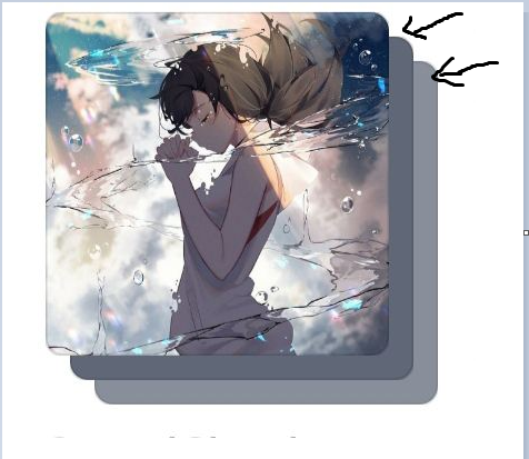
以下是我到目前为止try 过的:

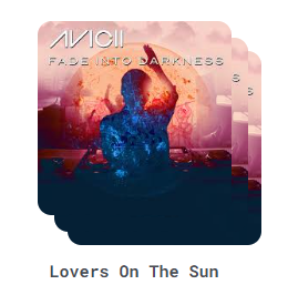
我的try 是:我将主图像复制了3次,然后将它们堆叠在一起.然而,我仍然不知道如何设计第二层和第三层图像的样式,以达到与样图相同的效果.我试过模糊和磨砂的玻璃效果,但看起来很可怕.

<div v-for="song in top4Songs" :key="song.id" class="song-container">
        <div id="parent">
          <div>               
              <div class="song-image-container">
                  <img :src="song.coverUrl">
              </div>
            
            <div class="song-info">
                <div class="song-image-container2">
                <img :src="song.coverUrl">
                <h2>{{song.title}}</h2>
            </div>           
              
            </div>
            <div class="song-image-container3">
              <img :src="song.coverUrl">
              
            </div>
          </div>
        </div>

CSS

/* second layer */
.song-image-container 
{
  position:absolute;
  top: 12px;
  left: 12px;
  z-index: 1;
}

/* first layer */
.song-image-container2 {
  position: relative;
  top: 0;
  left: 0;
  z-index: 2;
  /*  */ 
}
/*third layer*/
.song-image-container3 
{
  position: absolute; 
  top: 22px;
  left: 22px;
  z-index: 0;  
}

任何实现这一具体效果的建议都将受到真正的赞赏.

推荐答案

您可以使用一个div和图像来实现这一点.您只需在div中添加一个::before::after,并适当地设置它们的样式.::before::after的不透明度样式可能不适合这里,但您应该可以从这里降落飞机.

.song-image-container {
  border-radius: 20px;
  height: 360px;
  position: relative;
  width: 360px;
}

.song-image-container img {
  border-radius: 20px;
  height: 100%;
  object-fit: cover;
  width: 100%;
}

.song-image-container::before, 
.song-image-container::after {
  background-image: url(https://images.unsplash.com/photo-1495615080073-6b89c9839ce0?ixlib=rb-4.0.3&ixid=M3wxMjA3fDB8MHxzZWFyY2h8Mnx8c3F1YXJlfGVufDB8fDB8fHww&auto=format&fit=crop&w=800&q=60);
  background-size: cover;
  border-radius: 20px;
  content: '';
  height: 100%;
  left: 12px;
  opacity: 0.5;
  position: absolute;
  top: 12px;
  z-index: -1;
  width: 100%;
}
.song-image-container::after {
  border-radius: 20px;
  content: '';
  left: 24px;
  top: 24px;
  z-index: -2;
}

body {
    display: grid;
    height: 100vh;
    margin: 0;
    place-items: center;
}
<div class="song-image-container">
  <img src="https://images.unsplash.com/photo-1495615080073-6b89c9839ce0?ixlib=rb-4.0.3&ixid=M3wxMjA3fDB8MHxzZWFyY2h8Mnx8c3F1YXJlfGVufDB8fDB8fHww&auto=format&fit=crop&w=800&q=60" alt="cover art for...">
</div>

如果需要通过标记为背景提供图像,只需添加style="background-image: url(...imageurl...);"即可.这会给你同样的效果,你不需要 for each 元素调整CSS.

Css相关问答推荐

以百分比形式输入的css宽度属性不会生效

Mat-Form-字段占用更多区域,导致其他控件远离它

InertiaJS - Vue - Laravel:Using CSS Files

在AND设计令牌上使用不同的主题

MUI Textfield-悬停时输入标签 colored颜色

CSS关键帧中使用transform-origin存在问题的解决方案

CSS 布局:使一列依赖于另一列

CSS 字符串变量的正确null值是多少?

react 样式的条件类名称设置

父母是内联块,子元素有%填充=奇怪的行为

flex 容器中的两个滚动块

整个列的 CSS Grid Margin Top

css渐变实现2色虚线边框

Flexbox 子高度它的内容

是否可以对 CSS 网格中重复和可包装的列使用固定的最小和最大宽度?

将文本放在 div 的底部

CSSzoom 高度以匹配宽度 - 可能与外形尺寸

了解 Bootstrap 3 中的网格类( col-sm-# 和 col-lg-# )

CSS中伪元素前的&是什么意思?

在页面内容上方浮动一个 div