我想创建一个响应性的图片库使用Flexbox,其中每一行都有不同尺寸的图像,这些图像被zoom 到相同的高度,同时保留长宽比.例如,如果一行有一个100x50图像和一个100x100图像,则100x50图像应zoom 到200x100,以便这两个图像可以放置在高度为100px的行中.
换句话说,页面应该有两张这样的图片:
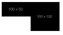
并像这样显示它们:
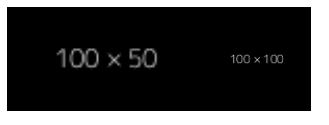
我试图通过在图像上使用min-height: 100%和width: auto来实现这一点.问题是,当100x50图像zoom 到200x100时,它溢出超过其art-item容器,而当放置第二个图像时,它与第一个图像重叠,结果如下所示:
以下是演示我的try 的一个片段:
.art-container {
  display: flex;
}

.art-item>img{
  min-height: 100%;
  width: auto;
}
<div class="art-container">
<div class="art-item"> <img src='https://dummyimage.com/100x50/000/fff'></img></div>
<div class="art-item"> <img src='https://dummyimage.com/100x100/000/fff'></img></div>
</div>我相信,如果有一种方法可以强迫art-item继承其包含img的宽度,那么这种情况是可以纠正的.如有任何其他建议,我们将不胜感激.