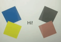
我试图创建这个美丽的动画使用html和css动画关键帧,但我卡住了.我试过改变旋转和变换,但我不能得到它变成像下面的图像.你可以从下面的图片中看到,盒子向内折叠以隐藏文本"Hi",然后它们向外展开,再次显示文本.盒子的 colored颜色 不是问题,我的动画有问题.
这就是我到目前为止所做的.
/* styles.css */
.container {
  display: flex;
  justify-content: center;
  align-items: center;
  height: 400px;
}

.group {
  display: flex;
  flex-direction: column;
  justify-content: center;
  width: 200px;
  margin: 0 15px;
}

.topleft {
  width: 100px;
  height: 75px;
  border-radius: 10px;
  margin: 0 auto;
  transform-origin: bottom left;
}

.topright {
  width: 100px;
  height: 75px;
  border-radius: 10px;
  margin: 0 auto;
  transform-origin: bottom left;
}

.bottomleft {
  width: 100px;
  height: 75px;
  border-radius: 10px;
  margin: 0 auto;
  transform-origin: bottom right;
}

.bottomright {
  width: 100px;
  height: 75px;
  border-radius: 10px;
  margin: 0 auto;
  transform-origin: bottom left;
}

.topleft {
  background-color: steelblue;
  animation: rotateTopLeft 2s linear infinite;
}

.topright {
  background-color: steelblue;
  animation: rotateTopRight 2s linear infinite;
}

.bottomleft {
  background-color: steelblue;
  animation: rotateTopLeft 2s linear infinite;
}

.bottomright {
  background-color: steelblue;
  animation: rotateTopRight 2s linear infinite;
}

@keyframes rotateTopLeft {
  0% {
    transform: rotate(0deg);
  }
  100% {
    transform: rotate(-90deg);
  }
}

@keyframes rotateTopRight {
  0% {
    transform: rotate(0deg);
  }
  100% {
    transform: rotate(-90deg);
  }
}

@keyframes rotateBottomLeft {
  0% {
    transform: rotate(0deg);
  }
  100% {
    transform: rotate(90deg);
  }
}

@keyframes rotateBottomRight {
  0% {
    transform: rotate(0deg);
  }
  100% {
    transform: rotate(-90deg);
  }
}

.bottomleft {
  background-color: yellow;
}

.topright {
  background-color: rosybrown;
}

.topright {
  background-color: diegray;
}

.space {
  width: 100px;
  height: 75px;
  display: flex;
  justify-content: center;
  align-items: center;
  font-size: 24px;
}
<div class="container">
<div class="group left">
<div class="box topleft steelblue"></div>
<div class="box bottomleft yellow"></div>
</div>
<div class="space">Hi</div>
<div class="group right">
<div class="box topright diegray"></div>
<div class="box bottomright rosybrown"></div>
</div>
</div>