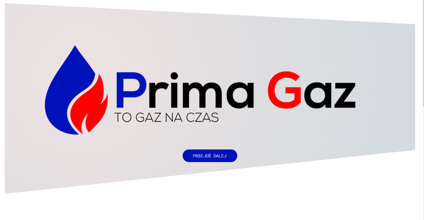
因此,我有几种方法可以处理这一问题.第一个clip-path并不是真的允许你在它之外做事情.因此,您将无法同时获得裁剪的背景和红色和蓝色.我做了两个小点心给你看.
第一个代码段保持标记不变,并使用::before和::after元素作为背景.::before创建红色和蓝色,::after具有包括径向渐变的裁剪背景.
body {
  font-family: "Anonymous Pro", monospace;
  font-weight: 400;
  font-size: 16px;
  line-height: 1, 7;
  color: #777;
  padding: 30px;
}

.header {
  height: 80vh;
  position: relative;
}

.header::before {
  background-image: linear-gradient(180deg, rgba(255, 0, 0, 1) 0%, rgba(255, 0, 0, 1) 50%, rgba(0, 15, 240, 1) 50%, rgba(0, 15, 240, 1) 100%);
  bottom: 0;
  color: black;
  content: '';
  left: 0;
  position: absolute;
  right: 0;
  top: 0;
  z-index: -2;
}

.header::after {
  animation-name: movefromright;
  animation-duration: 1.7s;
  animation-timing-function: ease-out;
  background-image: radial-gradient( circle at 18.7% 37.8%, rgb(238, 226, 226) 0%, rgb(211, 219, 223) 90%);
  backface-visibility: hidden;
  bottom: 0;
  clip-path: polygon(100% 11%, 100% 77%, 0 100%, 0 0);
  content: '';
  left: 0;
  position: absolute;
  right: 0;
  top: 0;
  z-index: -1;
}

.image {
  background-image: url(img/logo2.png);
  height: 80vh;
  position: relative;
  background-size: cover;
  background-position: top;
  backface-visibility: hidden;
  animation-name: movefromleft;
  animation-duration: 1.7s;
  animation-timing-function: ease-out;
}
<header class="header">
  <div class="image"></div>
  <div class="text-box">
    <div class="header-button">
      <a href="#zawartosc" class="btn btn-blue">Przejdź dalej</a>
    </div>
  </div>
</header>
第二个代码片断更改了标记,我建议您这样做.这将允许您将所有内容都放在裁剪的容器中,并具有蓝色和红色背景.这还允许您不必处理z-index和伪元素.这两个都不是坏事,但我认为只将标题换成行,并在那里应用背景会更容易一些.
被裁剪的元素的内容仍然需要适合被裁剪的容器.有几种方法可以解决这个问题.如果将裁剪的容器设置为同级元素并将其设置为position: absolute;,则它将位于所有元素之后.为此,您需要使Header元素(具有红色和蓝色背景)具有position: relative;.
我还会注意到你的.imagediv占据了整个高度,这就是当它在被裁剪的容器内时,你看不到的东西.
body {
  font-family: "Anonymous Pro", monospace;
  font-weight: 400;
  font-size: 16px;
  line-height: 1, 7;
  color: #777;
  padding: 30px;
}

header {
  background-image: linear-gradient(180deg, rgba(255, 0, 0, 1) 0%, rgba(255, 0, 0, 1) 50%, rgba(0, 15, 240, 1) 50%, rgba(0, 15, 240, 1) 100%);
}

.header-wrapper {
  height: 80vh;
  background-image: radial-gradient( circle at 18.7% 37.8%, rgb(238, 226, 226) 0%, rgb(211, 219, 223) 90%);
  clip-path: polygon(100% 11%, 100% 77%, 0 100%, 0 0);
  backface-visibility: hidden;
  background-position: top;
  color: black;
  position: relative;
  animation-name: movefromright;
  animation-duration: 1.7s;
  animation-timing-function: ease-out;
}

.image {
  background-image: url(img/logo2.png);
  height: 80vh;
  position: relative;
  background-size: cover;
  background-position: top;
  backface-visibility: hidden;
  animation-name: movefromleft;
  animation-duration: 1.7s;
  animation-timing-function: ease-out;
}
<header>
  <div class="header-wrapper">
    <div class="image"></div>
    <div class="text-box">
      <div class="header-button">
        <a href="#zawartosc" class="btn btn-blue">Przejdź dalej</a>
      </div>
    </div>
  </div>
</header>
在没有看到完整的设计和知道它是如何工作的情况下,我不确定我能给你一个更好的答案,但这应该会给你你需要的东西.