为什么每当我调整图片大小时,它会让我的其他元素移动,尽管有足够的空间和一个完全不同的容器.

我有这个#内容容器和#图片容器,它们都显示为内联块,它们在页面的同一行中,由于某种原因,每当我在#图片容器中调整我的img的大小时,它也会将我的#容器向下推,尽管它有完全不同的容器和足够的大小.这可能是什么原因造成的?

以下是我的代码

* {
    padding: 0;
    margin: 0;
    box-sizing: border-box;
    font-family: sans-serif;
/*  border: 1px solid red; */
}

header {
    display: flex;
    justify-content: space-between;
    margin-bottom: 3rem;
    background: black;
}

header a#logo {
    color: floralwhite;
    text-decoration: none;
    text-transform: uppercase;
    font-size: 2em;
    font-weight: 900;
    margin-left: 2rem;
    margin-top: 8px;
}

header ul {
    margin-right: 2rem;
    height: 80px;
}

header ul li {
    list-style: none;
    display: inline-block;
    margin-right: 8px;
    margin-top: 1rem;
/*  border: 1px solid red; */
    padding: 8px;
}

header ul li a {
    text-transform: uppercase;
    text-decoration: none;
    text-align: center;
    font-weight: 900;
    font-size: 1rem;
    color: floralwhite;
    padding: 8px;
    transition: outline 0.2s, color 0.2s, background 0.2s;
}

header ul li a:hover, header ul li a#active {
    outline: 1px solid black;
    color: black;
    background: floralwhite;
}

div#content {
    margin-left: 8rem;
    display: inline-block;
    margin-top: 4rem;
    position: relative;

}

div#content h1, div#content h2 {
    font-weight: 900;
}

div#content h2 {
    margin-top: -15px;
    text-indent: 5px;
    margin-bottom: 1rem;
}

div#content div#content2 {
    width: 400px;
    font-size: 1rem;
    font-weight: 500;
    text-indent: 5px;
}

div#content::after {
    content: "";
    height: 100%;
    width: 3%;
    background: black;
    position: absolute;
    top: 0px;
    left: -4rem;
    margin-left: 2rem;
}

span#pic, span#pic img {
    height: 250px;
    margin-left: 8rem;
/*  margin-top: ; */
    border: 1px solid white;
}
<!DOCTYPE html>
<html>
<head>
    <meta charset="utf-8">
    <meta name="viewport" content="width=device-width, initial-scale=1">
    <title> Andri Quin </title>
    <link rel="stylesheet" type="text/css" href="Portfolio.css">
    <link rel="icon" href="letter-a.png">
</head>
<body>  
    <header>
        <a href="#" id="logo"> Andri </a>
        <ul>
            <li> <a href="Portfolio.html" id="active"> Home </a> </li>
            <li> <a href=""> Info </a> </li>
            <li> <a href=""> About </a> </li>
        </ul>
    </header>

    <div id="content">
        <h1> Hi! Im Andri Quin </h1>
        <h2> Student Web Developer </h2>
        <div id="content2">
            <p> Im a student aspiring to be a fullstack web deveoper in the near future. I also studying game development as I love playing game as well.Please look forward my work in the near future. </p>
        </div>
    </div>

    <span id="pic">
        <img src="letter-a.png">
    </span>
</body>
</html>

下面是一些图片:

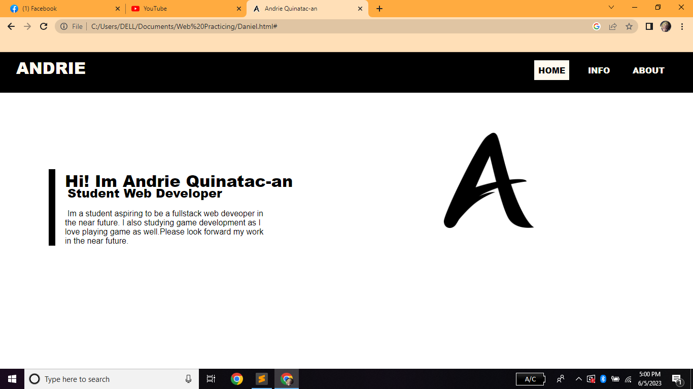
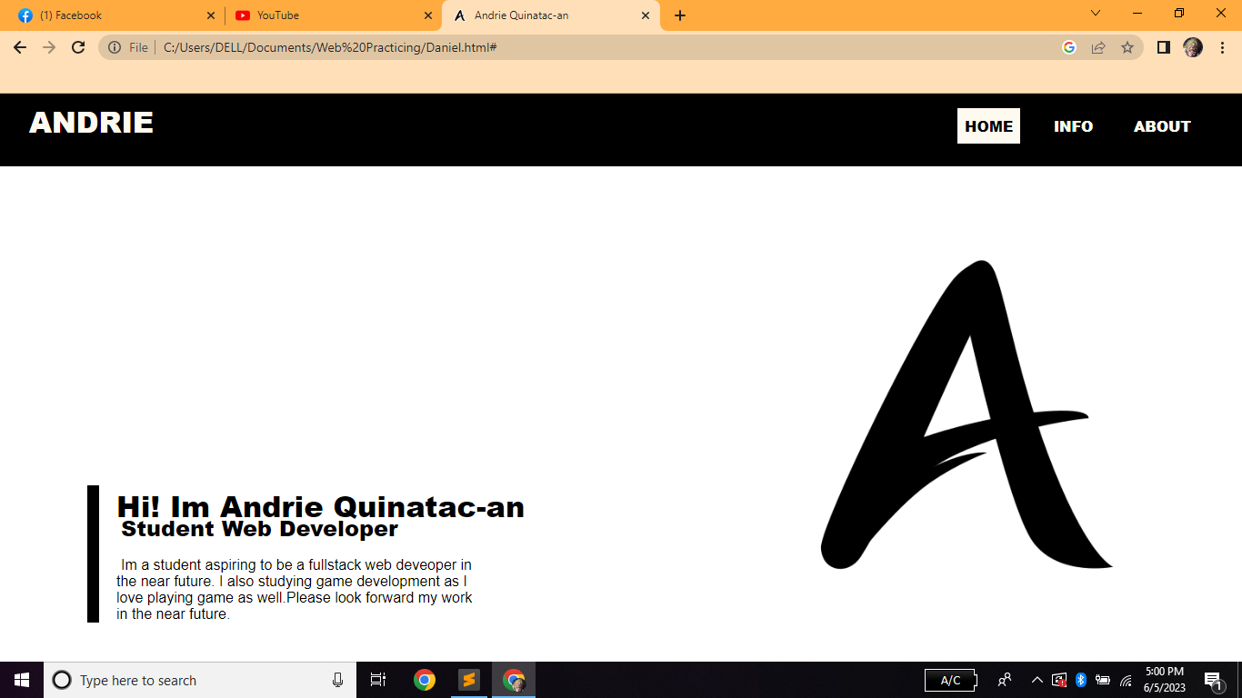
Before resizing the picture. After resizing the picture for some reason my content on the left side was pushed down. 一百零二

推荐答案

这是因为您将S的百岁显示设置为inline-block.这使得它是内联的,因此它与基线对齐,就像包含您的图像的<span>一样.

当图像增长到高于内容时,其包含的<span>也会增加,而与它的基线对齐保持不变,这会将<div>推向底部.

要解决这个问题,只需将两者包装在一个容器中,您将在row方向上将其设置为display: flex,如下例所示.如果您将其类名设置为"flex-wrapper",那么您只需要添加以下css:

.flex-wrapper {
  display: flex;
  flex-direction: row;
  flex-wrap: wrap;
  align-items: flex-start;
}

(I'm allowing the flex to wrap here to give you some kind of a fluid design, and keep a closer look to what you previously had)

这里有一个片段说明了这一点(请在"整页"中查看它,否则flex中的包装不会让你注意到它的效果).

* {
  padding: 0;
  margin: 0;
  box-sizing: border-box;
  font-family: sans-serif;
  /*  border: 1px solid red;*/
}

header {
  display: flex;
  justify-content: space-between;
  margin-bottom: 3rem;
  background: black;
}

header a#logo {
  color: floralwhite;
  text-decoration: none;
  text-transform: uppercase;
  font-size: 2em;
  font-weight: 900;
  margin-left: 2rem;
  margin-top: 8px;
}

header ul {
  margin-right: 2rem;
  height: 80px;
}

header ul li {
  list-style: none;
  display: inline-block;
  margin-right: 8px;
  margin-top: 1rem;
  /*  border: 1px solid red;*/
  padding: 8px;
}

header ul li a {
  text-transform: uppercase;
  text-decoration: none;
  text-align: center;
  font-weight: 900;
  font-size: 1rem;
  color: floralwhite;
  padding: 8px;
  transition: outline 0.2s, color 0.2s, background 0.2s;
}

header ul li a:hover,
header ul li a#active {
  outline: 1px solid black;
  color: black;
  background: floralwhite;
}

div#content {
  margin-left: 8rem;
  display: inline-block;
  margin-top: 4rem;
  position: relative;
}

div#content h1,
div#content h2 {
  font-weight: 900;
}

div#content h2 {
  margin-top: -15px;
  text-indent: 5px;
  margin-bottom: 1rem;
}

div#content div#content2 {
  width: 400px;
  font-size: 1rem;
  font-weight: 500;
  text-indent: 5px;
}

div#content::after {
  content: "";
  height: 100%;
  width: 3%;
  background: black;
  position: absolute;
  top: 0px;
  left: -4rem;
  margin-left: 2rem;
}

span#pic,
span#pic img {
  height: 250px;
  margin-left: 8rem;
  /*  margin-top: ;*/
  border: 1px solid white;
}

.flex-wrapper {
  display: flex;
  flex-direction: row;
  flex-wrap: wrap;
  align-items: flex-start;
}
<!DOCTYPE html>
<html>

<head>
  <meta charset="utf-8">
  <meta name="viewport" content="width=device-width, initial-scale=1">
  <title> Andri Quin </title>
  <link rel="stylesheet" type="text/css" href="Portfolio.css">
  <link rel="icon" href="letter-a.png">
</head>

<body>
  <header>
    <a href="#" id="logo"> Andri </a>
    <ul>
      <li> <a href="Portfolio.html" id="active"> Home </a> </li>
      <li> <a href=""> Info </a> </li>
      <li> <a href=""> About </a> </li>
    </ul>
  </header>

  <div class="flex-wrapper">

    <div id="content">
      <h1> Hi! Im Andri Quin </h1>
      <h2> Student Web Developer </h2>
      <div id="content2">
        <p> Im a student aspiring to be a fullstack web deveoper in the near future. I also studying game development as I love playing game as well.Please look forward my work in the near future. </p>
      </div>
    </div>

    <span id="pic">
      <img src="https://i.stack.imgur.com/8UBho.png">
    </span>
  
  </div>
</body>

</html>

Html相关问答推荐

电话号码验证器(Angular )

react :事件和转发器在特定代码段中不起作用

如何在伪元素背景中定位多个CSS径向梯度

我怎样才能在我的网站上制作花哨的角落

水平卷轴的内容保持堆叠

如何将功能附加到嵌入式药剂中的按钮?

视频重新加载而不是在 Swift 中暂停 WKWebView

为什么我的 html 对话框在 React 中没有渲染在我的内容之上?

为什么 html 元素的 max-width 和 width 一起工作?

使用 popover api 和 `

::可点击图标之前

css 网格创建空行和列

用于表行组标题的正确 HTML 标记是什么?

Cargo 在网格中的排列

如何在滚动行中显示一张图片和下一张图片的一半?

如何使用 CSS 使粘性元素固定在视口顶部

如何使用 CSS 和 HTML 将文本放入图像中?

如果不透明的元素出现在下方,为什么不透明度会使一个元素出现在另一个元素上方?

防止 HTML 表格在 Quarto 中使用全页宽度

如何将内容从侧边栏的底部移动到右侧?