我有以下代码:

.parent {
  /* This has a dynamic height */
  display: flex;
  gap: 1em;
  padding: 1em;
  background-color: lightblue;
}

.wrapper {
  width: 150px;
  /* This is a dynamic fixed width */
  display: flex;
  justify-content: center;
  padding: 1em;
  flex-direction: column;
  overflow: hidden;
  background-color: lightcoral;
}

.image-div {
  height: 100%;
  display: flex;
  padding: 10px;
  gap: 5px;
  overflow: hidden;
  background-color: lightgreen;
}

.image {
  height: 100%;
  max-height: 50px; /* Remove this so green box stays the same size and images grow to fill it */

}
<div class='parent'>
  <div class='wrapper'>
    <div class='image-div'>
      <img class='image' src="https://picsum.photos/50/200" />
      <img class='image' src="https://picsum.photos/50/150" />
      <img class='image' src="https://picsum.photos/50/100" />
    </div>
  </div>
  <div class='wrapper'>
    <span> This </span>
    <span> text </span>
    <span> should </span>
    <span> dictate </span>
    <span> dictate </span>
    <span> max </span>
    <span> height </span>
  </div>
  <div class='wrapper'>
    <span> Small text </span>
    <span> doesn't matter </span>
  </div>
</div>

我的目标是让图像符合绿色框的高度(宽度并不重要,因为为了保持长宽比,它们会溢出,这是一个有意和重要的行为).但是,如果从图像中删除注释的max-Size,它会增长到实际大小,从而使父红色div增长到适合它的大小:

Notice red div growing

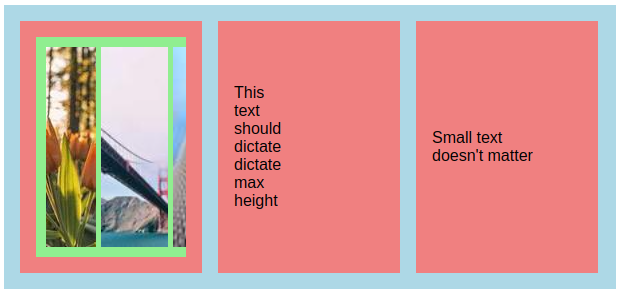
有没有什么简单的方法可以得到这样的结果,即图像只是增长到适合可用的大小:

Image just grows until it reaches the current red div height

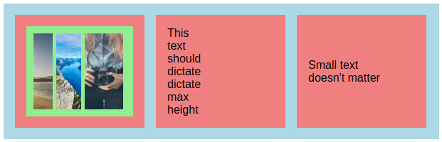
这一点很重要,因为蓝色矩形的高度根据所有其他红色矩形的内容而变化,绿色矩形是唯一不应该展开它的矩形.此外,考虑到问题的性质和使用它的上下文,我更喜欢在没有JS的情况下完成这项工作,只使用普通的CSS.

推荐答案

在图像上使用height: 0;min-height: 100%,而不是使用height: 100%.这将禁用图像的大小贡献,同时强制它们填充所有高度.

.parent {
  display: flex;
  gap: 1em;
  padding: 1em;
  background-color: lightblue;
}

.wrapper {
  width: 150px;
  display: flex;
  justify-content: center;
  padding: 1em;
  flex-direction: column;
  overflow: hidden;
  background-color: lightcoral;
}

.image-div {
  height: 100%;
  display: flex;
  padding: 10px;
  gap: 5px;
  overflow: hidden;
  background-color: lightgreen;
}

.image {
  height: 0;
  min-height: 100%
}
<div class='parent'>
  <div class='wrapper'>
    <div class='image-div'>
      <img class='image' src="https://picsum.photos/50/200" />
      <img class='image' src="https://picsum.photos/50/150" />
      <img class='image' src="https://picsum.photos/50/100" />
    </div>
  </div>
  <div class='wrapper'>
    <span> This </span>
    <span> text </span>
    <span> should </span>
    <span> dictate </span>
    <span> dictate </span>
    <span> max </span>
    <span> height </span>
  </div>
  <div class='wrapper'>
    <span> Small text </span>
    <span> doesn't matter </span>
  </div>
</div>

Html相关问答推荐

如何防止下拉菜单内的Bootstrap列表行包装?

如何删除html原生对话框的宽度

禁用与行分开的边框折叠span

带有MathJax SVG的HTML代码在XHTML中不起作用

嵌套表列高度不是100%高度的问题

调整一组IMG的大小以适应容器DIV

如何用背景色填充边框半径创建的间隙

如何使单选按钮在被 Select /选中时看起来像这样的设计?

如何将图像放在其内部按钮下方

如何保持块扩展以填充视口?

在DIV上应用梯度模糊未如预期工作

输入框不是全宽

提交前的验证表单未显示任何验证消息?

暗模式转换器

如何在 blazor 中单击单个按钮调用 2 个等待任务

如何让 Reindeer 居中

浮动元素忽略 margin-top 属性后的块元素

当另一个 div 的高度改变或执行其内容的换行时,将 flex 方向更改为列

如何使用 :hover zoom 重叠图像?

图标未定位到右上角