抱歉,标题令人困惑.想不出更好的办法了.无论如何,我想要在网格中列出项目.想想网上store 里的产品吧.每件物品的宽度和高度都是固定的,但物品的数量可以改变.最终目标是让所有东西都能响应,这样它在移动和桌面上都会看起来很好.
这是我的代码:
<!doctype html>
<html>
    <head>
        <meta name="viewport" content="width=device-width, minimum-scale=1.0, maximum-scale=1.0, user-scalable=no" />
        <style>
            .container {
                display: flex;
                flex-wrap: wrap;
                justify-content: center;
                gap: 1rem;
                background-color: #ffaa00;
                margin-left: auto;
                margin-right: auto;
                width: 90%;
            }

            .item {
                width: 15rem;
                height: 15rem;
                background-color: #0088ff;
            }
        </style>
    </head>
    <body>
        <div class="container">
            <div class="item">1</div>
            <div class="item">2</div>
            <div class="item">3</div>
            <div class="item">4</div>
        </div>
    </body>
</html>
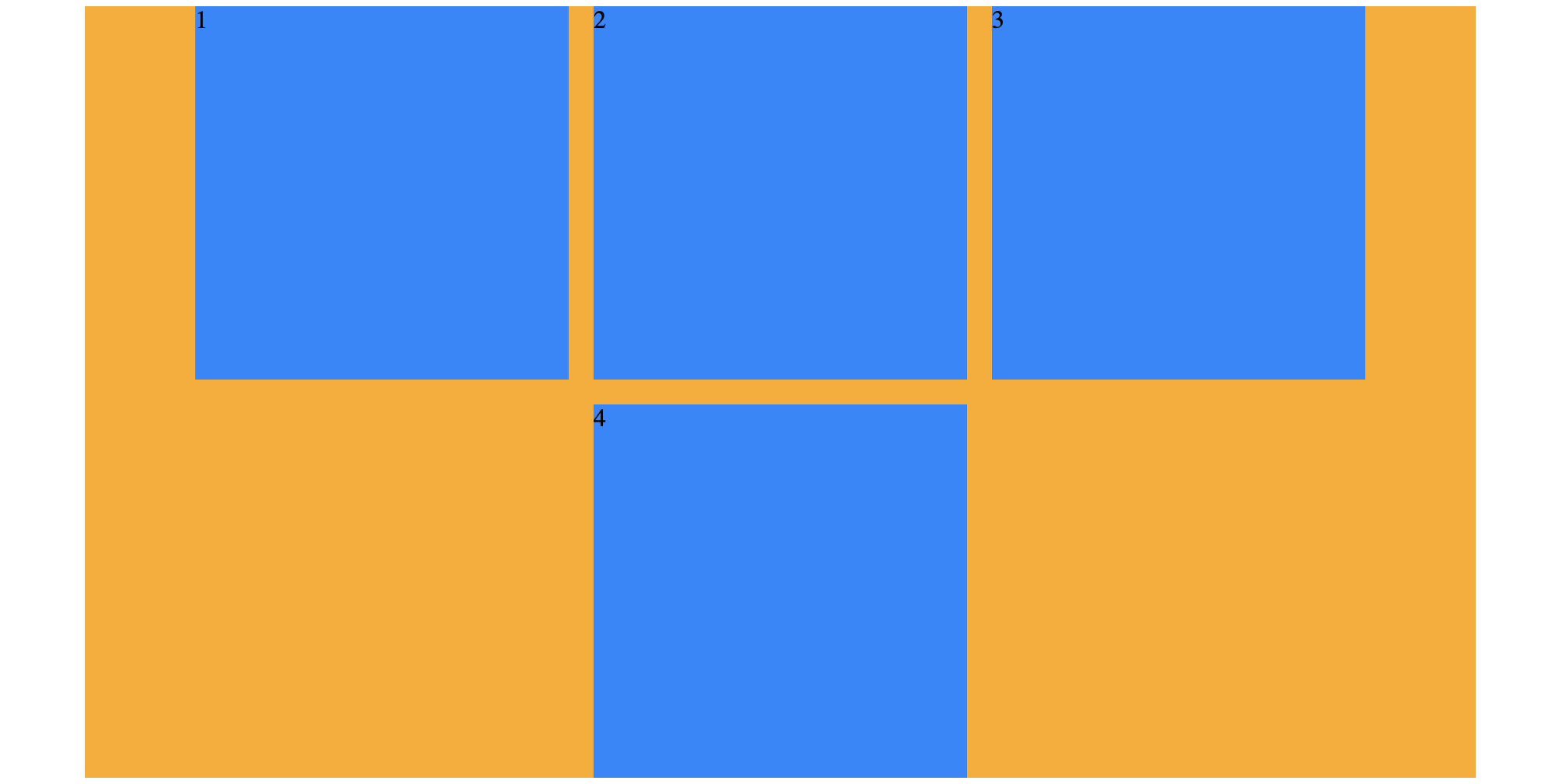
一切看起来都像预期的一样,但我希望包装的项目(如果包装的项目数量不等于一整行)靠左对齐,而不是居中对齐.但我仍然希望"整行"中的所有项目都居中对齐.我会加上一些图片来澄清这一点.
This is what I get:
This is what my goal is:

如果我设置"JUSTIFY-CONTENT:LEFT",所有项目都将靠左对齐,这也不是我想要的……