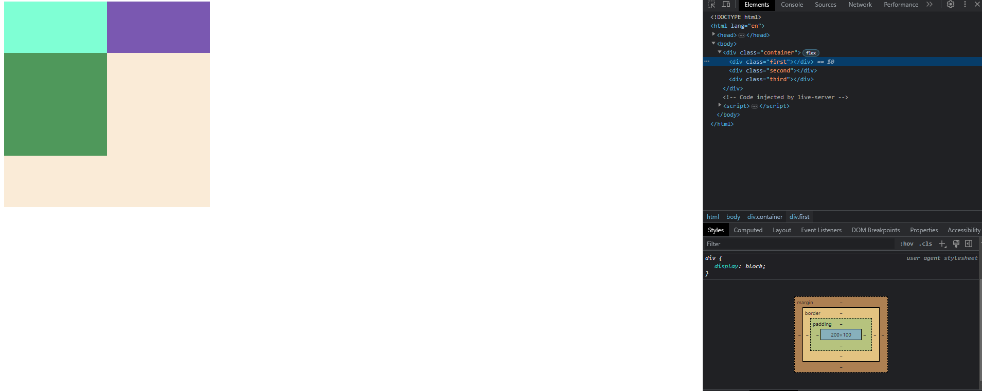
代码是这样的:
.container {
  display: flex;
  flex-wrap: wrap;
  width: 400px;
  height: 400px;
  background-color: antiquewhite;
}

.first {
  width: 200px;
  background-color: aquamarine;
}

.second {
  width: 200px;
  background-color: rgb(122, 88, 177);
}

.third {
  width: 200px;
  height: 200px;
  background-color: rgb(79, 152, 91);
}
<div class="container">
<div class="first"></div>
<div class="second"></div>
<div class="third"></div>
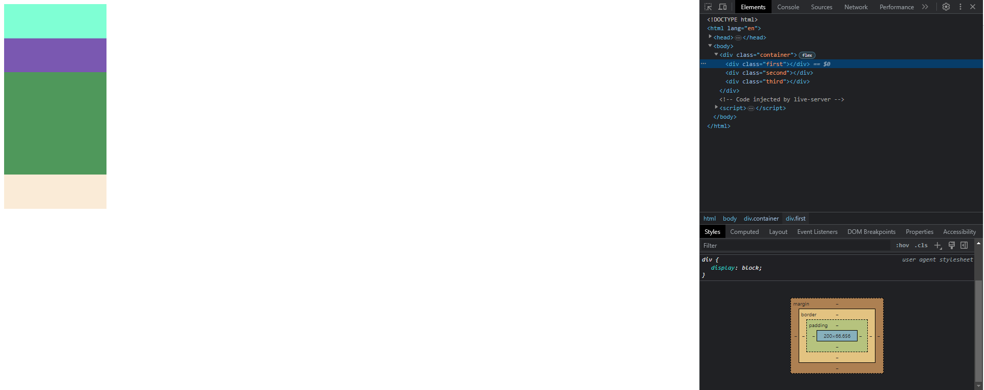
</div>当.container的宽度为400px时,.third块将换行到另一行,.first和.second元素的高度为.containerpx,但当.container的宽度为200px时,.first和.second元素的高度为66.6px.
我不明白为什么会发生这样的事情,也不明白它是如何运作的.
我试着用一种合乎逻辑的方式来解决这个问题,但尺寸不符合任何计算.