我刚刚了解到,只有当有多行时,‘Align-Content’属性才起作用.因为这个属性是关于项目行之间的. 因此,如果只有一行,则此属性不能有影响.
* {
  box-sizing: border-box;
  font-size: 1.5rem;
}

html {
  background: #b3b3b3;
  padding: 5px;
}

body {
  background: #b3b3b3;
  padding: 5px;
  margin: 0;
}

.flex-container {
  background: white;
  padding: 10px;
  height: 1300px;
  border: 5px solid black;
  display: flex;
  flex-flow: wrap row;
  justify-content: center;
  align-items: center;
  align-content:flex-start
}

.item-1 {
  background: #ff7300;
  color: white;
  padding: 10px;
  border: 5px solid black;
  margin: 10px;
}

.item-2 {
  background: #ff9640;
  color: white;
  padding: 10px;
  border: 5px solid black;
  margin: 10px;
  width: 250px;
  font-size: 1.8rem;
}

.item-3 {
  background: #ff9640;
  color: white;
  padding: 10px;
  border: 5px solid black;
  margin: 10px;
  height: 250px;
}

.item-4 {
  background: #f5c096;
  color: white;
  padding: 10px;
  border: 5px solid black;
  margin: 10px;
  width: 300px;
  height: 300px;
}

.item-5 {
  background: #d3c0b1;
  color: white;
  padding: 10px;
  border: 5px solid black;
  margin: 10px;
  width: 350px;
}

.item-6 {
  background: #d3c0b1;
  color: white;
  padding: 10px;
  border: 5px solid black;
  margin: 10px;
  width: 350px;
}
<!DOCTYPE html>
<html lang="en">
    <head>
        <meta charset="UTF-8">
        <meta http-equiv="X-UA-Compatible" content="ie=edge">
        <link rel="stylesheet" href="main.css">
        <title>Flexbox</title>
    </head>
    <body>
        <div class="flex-container">
            <div class="item-1">div</div>
            <div class="item-2">w=250px</div>
            <div class="item-3">h=250px</div>
            <div class="item-4">w/h=300px</div>
            <div class="item-5">w=350px</div>
            <div class="item-6">w=350px</div>
        </div>
    </body>
</html>
但在这种情况下,我申请了
  display: flex;
  flex-flow: wrap row;
  justify-content: center;
  align-items: center;
  align-content:flex-start
根据我所了解的,Align-Content应该不起作用,因为只有一行.因此,这些物品应该放在"弹性容器"的中心.
but it's placed on the top like below which it should not be
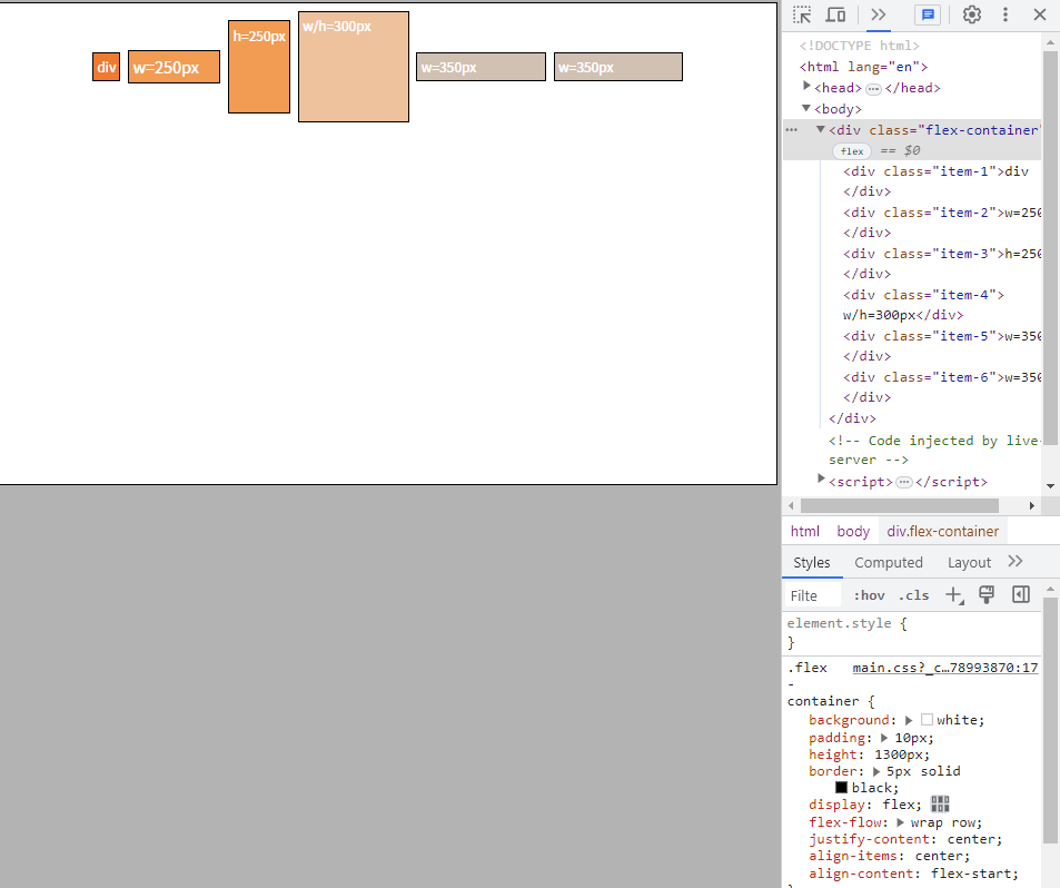
你能解释一下这件事吗?