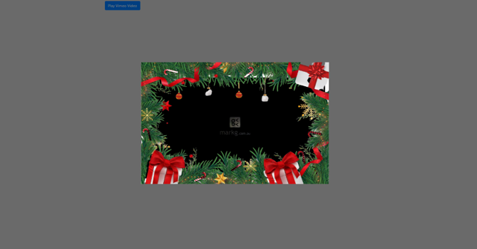
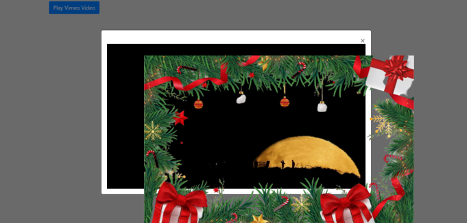
我想把一个框架放在一个css模式中,但它的显示方式并不是最令人愉快的,此外,就像我手动进行的调整(上图和左图)一样,对于其他屏幕尺寸,图像配置错误(框架在模式之外).如下图所示.

在大屏幕上

在大屏幕上

在小屏幕上

在小屏幕上

我使用以下代码来获得上述结果

<!DOCTYPE html>
<html lang="en">
<head>
    <meta charset="UTF-8">
    <meta http-equiv="X-UA-Compatible" content="IE=edge">
    <meta name="viewport" content="width=device-width, initial-scale=1.0">
    <link rel="stylesheet" href="https://cdn.jsdelivr.net/npm/bootstrap@4.0.0/dist/css/bootstrap.min.css"
        integrity="sha384-Gn5384xqQ1aoWXA+058RXPxPg6fy4IWvTNh0E263XmFcJlSAwiGgFAW/dAiS6JXm" crossorigin="anonymous">
    <title>Document</title>
    <style>
        body {
            width: 100vw;
            height: 100vh;
            background: lightgray;
        }

        .frame-card {
            width: 800px;
            height: 520px;
            position: absolute;
            top: 25%;
            left: 31.2%;
        }
    </style>
</head>

<body>
    <div class="container mt-2">
        <!-- Button trigger modal -->
        <button type="button" class="btn btn-primary video-btn" data-toggle="modal"
            data-src="https://player.vimeo.com/video/58385453?badge=0&autoplay=1&loop=1" data-target="#myModal">
            Play Vimeo Video
        </button>
        <!-- Modal -->
        <div class="modal fade" id="myModal" tabindex="-1" role="dialog" aria-labelledby="exampleModalLabel"
            aria-hidden="true">
            <div class="modal-dialog modal-dialog-centered modal-lg" role="document">
                <div class="modal-content">
                    <div class="modal-body">
                        <button type="button" class="close" data-dismiss="modal" aria-label="Close">
                            <span aria-hidden="true">&times;</span>
                        </button>
                        <!-- 16:9 aspect ratio -->
                        <div class="embed-responsive embed-responsive-16by9">
                            <iframe class="embed-responsive-item" src="" id="video" allowscriptaccess="always"
                                allow="autoplay">
                            </iframe>
                        </div>
                    </div>
                </div>
            </div>
            <img class="frame-card" src="https://uploaddeimagens.com.br/images/004/266/329/original/frame-card.png?1671470988">
        </div>
    </div>
    <script src="https://code.jquery.com/jquery-3.2.1.slim.min.js"
        integrity="sha384-KJ3o2DKtIkvYIK3UENzmM7KCkRr/rE9/Qpg6aAZGJwFDMVNA/GpGFF93hXpG5KkN" crossorigin="anonymous">
        </script>
    <script src="https://cdn.jsdelivr.net/npm/popper.js@1.12.9/dist/umd/popper.min.js"
        integrity="sha384-ApNbgh9B+Y1QKtv3Rn7W3mgPxhU9K/ScQsAP7hUibX39j7fakFPskvXusvfa0b4Q" crossorigin="anonymous">
        </script>
    <script src="https://cdn.jsdelivr.net/npm/bootstrap@4.0.0/dist/js/bootstrap.min.js"
        integrity="sha384-JZR6Spejh4U02d8jOt6vLEHfe/JQGiRRSQQxSfFWpi1MquVdAyjUar5+76PVCmYl" crossorigin="anonymous">
        </script>
    <script>
        $(document).ready(function () {
            // Gets the video src from the data-src on each button
            var $videoSrc;
            $('.video-btn').click(function () {
                $videoSrc = $(this).data("src");
            });
            // when the modal is opened autoplay it  
            $('#myModal').on('shown.bs.modal', function (e) {
                // set the video src to autoplay and not to show related video. Youtube related video is like a box of chocolates... you never know what you're gonna get
                $("#video").attr('src', $videoSrc);
            })
            // stop playing the youtube video when I close the modal
            $('#myModal').on('hide.bs.modal', function (e) {
                // a poor man's stop video
                $("#video").attr('src', $videoSrc);
            })
            // document ready  
        });
    </script>
</body>
</html>

我应该使用什么类或样式?

提前谢谢!

我使用了带绝对值的位置属性来对齐图像,我不知道这是不是正确的方法,此外,我使用了左对齐和顶部对齐,我想要一种更"自动"的方式来对齐图像.

推荐答案

我不完全确定你想要的结果,但是,我已经设法把画面整齐地放在视频周围了.将.frame-card移到iframe之后的.embed-responsive.embed-responsive-16by9内,只需给它.embed-responsive-item,不需要额外的样式,因为它将具有与视频相同的大小/位置(iframe.embed-responsive-item)

$(document).ready(function() {
  // Gets the video src from the data-src on each button
  var $videoSrc;
  $('.video-btn').click(function() {
    $videoSrc = $(this).data("src");
  });
  // when the modal is opened autoplay it  
  $('#myModal').on('shown.bs.modal', function(e) {
    // set the video src to autoplay and not to show related video. Youtube related video is like a box of chocolates... you never know what you're gonna get
    $("#video").attr('src', $videoSrc);
  })
  // stop playing the youtube video when I close the modal
  $('#myModal').on('hide.bs.modal', function(e) {
    // a poor man's stop video
    $("#video").attr('src', $videoSrc);
  })
  // document ready  
});
body {
  width: 100vw;
  height: 100vh;
  background: lightgray;
}
<link rel="stylesheet" href="https://cdn.jsdelivr.net/npm/bootstrap@4.0.0/dist/css/bootstrap.min.css" integrity="sha384-Gn5384xqQ1aoWXA+058RXPxPg6fy4IWvTNh0E263XmFcJlSAwiGgFAW/dAiS6JXm" crossorigin="anonymous">

<div class="container mt-2">
  <!-- Button trigger modal -->
  <button type="button" class="btn btn-primary video-btn" data-toggle="modal" data-src="https://player.vimeo.com/video/58385453?badge=0&autoplay=1&muted=1&loop=1" data-target="#myModal">
    Play Vimeo Video
  </button>
  <!-- Modal -->
  <div class="modal fade" id="myModal" tabindex="-1" role="dialog" aria-labelledby="exampleModalLabel" aria-hidden="true">
    <div class="modal-dialog modal-dialog-centered modal-lg" role="document">
      <div class="modal-content">
        <div class="modal-body">
          <button type="button" class="close" data-dismiss="modal" aria-label="Close">
            <span aria-hidden="true">&times;</span>
          </button>
          <!-- 16:9 aspect ratio -->
          <div class="embed-responsive embed-responsive-16by9">
            <iframe class="embed-responsive-item" src="" id="video" allowscriptaccess="always" allow="autoplay">
            </iframe>
            <img class="embed-responsive-item" src="https://uploaddeimagens.com.br/images/004/266/329/original/frame-card.png?1671470988">
          </div>
        </div>
      </div>
    </div>
  </div>
</div>

<script src="https://code.jquery.com/jquery-3.2.1.slim.min.js" integrity="sha384-KJ3o2DKtIkvYIK3UENzmM7KCkRr/rE9/Qpg6aAZGJwFDMVNA/GpGFF93hXpG5KkN" crossorigin="anonymous">
</script>
<script src="https://cdn.jsdelivr.net/npm/popper.js@1.12.9/dist/umd/popper.min.js" integrity="sha384-ApNbgh9B+Y1QKtv3Rn7W3mgPxhU9K/ScQsAP7hUibX39j7fakFPskvXusvfa0b4Q" crossorigin="anonymous">
</script>
<script src="https://cdn.jsdelivr.net/npm/bootstrap@4.0.0/dist/js/bootstrap.min.js" integrity="sha384-JZR6Spejh4U02d8jOt6vLEHfe/JQGiRRSQQxSfFWpi1MquVdAyjUar5+76PVCmYl" crossorigin="anonymous">
</script>

注:

您需要将&muted=1添加到视频源URL才能自动播放:https://vimeo.zendesk.com/hc/en-us/articles/115004485728-Autoplay-and-loop-embedded-videos视频在片段中不起作用,但您可以在我的fiddle中查看它.

Css相关问答推荐

如何在CSS calc()中使用反向百分比/无单位计算?

容器内的中心固定元件

如何使用在另一个层定义块中定义的sass层作用域变量

CSS子网格不显示行间距

如何将Ant设计日期 Select 器的图标设置在输入 Select 器之前而不是之后

如果 css 仅位于 razor 页面中的一页上,我是否仍应在 wwwroot 中写入或仅将其放在页面上?

每当键盘在react native 中打开时,如何使用 KeyboardAvoidingView 删除图像?

如何在父叠加层之上呈现子子

网格在行方向上的大小不正确

如何使用 TailwindCSS 水平设置输入和按钮

当页面大小小于VH时,Tailwind CSS如何使页脚留在底部

在样式化组件中使图像重叠

基于类的 CSS Select 器

CSS3 的 :root 伪类和 html 有什么区别?

滚动到该 div 后如何使 div 固定?

在响应式设计中指定 HTML 文本中的首选换行点

如何将 bootstrap 列高设为 100% 行高?

如何在 Chrome 的判断器中添加/插入之前或之后的伪元素?

打印html时在页面上打印页码

为什么 height:0 不隐藏我的填充