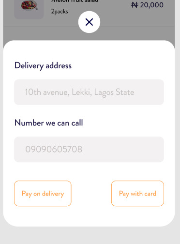
the default ModalBottomsheet is not give me a flexibility to customize the UI to look like the UI in the screenshot
推荐答案
You can customize the 100 to match the UI from the picture, and here is an example:
首先,在BottomSheet可组合函数中添加以下参数:
isBottomSheetVisible: Boolean-用于控制底板的可见性.sheetState: SheetState-底板的状态.onDismiss: () -> Unit-取消底页的回调.
然后,将ModalBottomSheet Inside if (isBottomSheetVisible) {}块包起来,并更改以下图纸属性:
onDismissRequest到onDismiss.sheetState到sheetState.containerColor到Color.Transparent.contentColor到您的内容 colored颜色 ,例如文本 colored颜色 .shape到RectangleShape.dragHandle%至null%scrimColor到设计的细布 colored颜色 (例如Color.Black.copy(alpha = .5f)).- 如果启用了100,则可以 Select 将
windowInsets设置为WindowInsets(0, 0, 0, 0),以展开系统栏下方的底部工作表.
到目前为止,BottomSheet个可组合元素应该如下所示:
@OptIn(ExperimentalMaterial3Api::class)
@Composable
fun BottomSheet(
    isBottomSheetVisible: Boolean,
    sheetState: SheetState,
    onDismiss: () -> Unit
) {

    if (isBottomSheetVisible) {

        ModalBottomSheet(
            onDismissRequest = onDismiss,
            sheetState = sheetState,
            containerColor = Color.Transparent,
            contentColor = MaterialTheme.colorScheme.onSurface,
            shape = RectangleShape,
            dragHandle = null,
            scrimColor = Color.Black.copy(alpha = .5f),
            windowInsets = WindowInsets(0, 0, 0, 0)
        ) {

            // Implement the custom layout here ...

        }

    }

}
现在,您可以开始在ModalBottomSheet的content块内实现自定义布局:
- 用于取消
ModalBottomSheet的居中按钮可以包裹在Box中,并对其进行进一步的定制:
Box(
    modifier = Modifier
        .statusBarsPadding()
        .fillMaxWidth()
        .padding(8.dp),
    contentAlignment = Alignment.Center
) {

    FilledIconButton(
        modifier = Modifier.size(48.dp),
        onClick = onDismiss,
        colors = IconButtonDefaults.filledIconButtonColors(
            containerColor = MaterialTheme.colorScheme.background
        )
    ) {

        Icon(
            imageVector = Icons.Rounded.Close,
            contentDescription = "Dismiss the dialog."
        )

    }

}
- 然后,在
Box下面添加一个Column,并实现其余的UI组件:
Column(
    modifier = Modifier
        .navigationBarsPadding()
        .padding(12.dp) // Outer padding
        .clip(shape = RoundedCornerShape(24.dp))
        .background(color = MaterialTheme.colorScheme.background)
        .fillMaxWidth()
        .padding(24.dp) // Inner padding
) {

    Spacer(modifier = Modifier.height(16.dp))

    OutlinedTextField(
        modifier = Modifier.fillMaxWidth(),
        value = "10th avenue, Some, State",
        onValueChange = {},
        label = { Text(text = "Delivery Address") },
        readOnly = true,
        shape = RoundedCornerShape(12.dp)
    )

    Spacer(modifier = Modifier.height(24.dp))

    OutlinedTextField(
        modifier = Modifier.fillMaxWidth(),
        value = "09090606000",
        onValueChange = {},
        label = { Text(text = "Number we can call") },
        readOnly = true,
        shape = RoundedCornerShape(12.dp)
    )

    Spacer(modifier = Modifier.height(48.dp))

    Row(
        modifier = Modifier.fillMaxWidth(),
        verticalAlignment = Alignment.CenterVertically,
        horizontalArrangement = Arrangement.SpaceBetween
    ) {

        OutlinedButton(
            onClick = {},
            content = { Text(text = "Pay on delivery") }
        )

        OutlinedButton(
            onClick = {},
            content = { Text(text = "Pay with card") }
        )

    }

}
最后,在需要底页的任何地方,声明以下变量:
scope-用于有效地展开或隐藏底片的协程作用域.isBottomSheetVisible-用于控制底板可见性.sheetState-底部工作表的状态.
然后,实施BottomSheet个可组合:
val scope = rememberCoroutineScope()
var isBottomSheetVisible by rememberSaveable { mutableStateOf(false) }
val sheetState = rememberModalBottomSheetState(
    skipPartiallyExpanded = true
)

BottomSheet(
    isBottomSheetVisible = isBottomSheetVisible,
    sheetState = sheetState,
    onDismiss = {
        scope.launch { sheetState.hide() }
            .invokeOnCompletion { isBottomSheetVisible = false }
    }
)
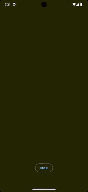
这是我编写的完整代码和一个可视化演示:
class MainActivity : ComponentActivity() {

    @OptIn(ExperimentalMaterial3Api::class)
    override fun onCreate(savedInstanceState: Bundle?) {
        super.onCreate(savedInstanceState)
        setContent {
            MyApplicationTheme {

                // A surface container using the 'background' color from the theme
                Surface(
                    modifier = Modifier.fillMaxSize(),
                    color = MaterialTheme.colorScheme.background
                ) {

                    val scope = rememberCoroutineScope()
                    var isBottomSheetVisible by rememberSaveable { mutableStateOf(false) }
                    val sheetState = rememberModalBottomSheetState(
                        skipPartiallyExpanded = true
                    )

                    // A box with a simple button
                    // just to show the bottom sheet.
                    Box(
                        modifier = Modifier
                            .fillMaxSize()
                            .systemBarsPadding()
                            .padding(64.dp),
                        contentAlignment = Alignment.BottomCenter
                    ) {

                        OutlinedButton(
                            onClick = {
                                scope.launch {
                                    isBottomSheetVisible = true
                                    sheetState.expand()
                                }
                            }
                        ) {
                            Text(text = "Show")
                        }

                    }

                    BottomSheet(
                        isBottomSheetVisible = isBottomSheetVisible,
                        sheetState = sheetState,
                        onDismiss = {
                            scope.launch { sheetState.hide() }
                                .invokeOnCompletion { isBottomSheetVisible = false }
                        }
                    )

                }
            }
        }
    }

}

@OptIn(ExperimentalMaterial3Api::class)
@Composable
fun BottomSheet(
    isBottomSheetVisible: Boolean,
    sheetState: SheetState,
    onDismiss: () -> Unit
) {

    if (isBottomSheetVisible) {

        ModalBottomSheet(
            onDismissRequest = onDismiss,
            sheetState = sheetState,
            containerColor = Color.Transparent,
            contentColor = MaterialTheme.colorScheme.onSurface,
            shape = RectangleShape,
            dragHandle = null,
            scrimColor = Color.Black.copy(alpha = .5f),
            windowInsets = WindowInsets(0, 0, 0, 0)
        ) {

            Box(
                modifier = Modifier
                    .statusBarsPadding()
                    .fillMaxWidth()
                    .padding(8.dp),
                contentAlignment = Alignment.Center
            ) {

                FilledIconButton(
                    modifier = Modifier.size(48.dp),
                    onClick = onDismiss,
                    colors = IconButtonDefaults.filledIconButtonColors(
                        containerColor = MaterialTheme.colorScheme.background
                    )
                ) {

                    Icon(
                        imageVector = Icons.Rounded.Close,
                        contentDescription = "Hide the dialog."
                    )

                }

            }

            Column(
                modifier = Modifier
                    .navigationBarsPadding()
                    .padding(12.dp) // Outer padding
                    .clip(shape = RoundedCornerShape(24.dp))
                    .background(color = MaterialTheme.colorScheme.background)
                    .fillMaxWidth()
                    .padding(24.dp) // Inner padding
            ) {

                Spacer(modifier = Modifier.height(16.dp))

                OutlinedTextField(
                    modifier = Modifier.fillMaxWidth(),
                    value = "10th avenue, Some, State",
                    onValueChange = {},
                    label = { Text(text = "Delivery Address") },
                    readOnly = true,
                    shape = RoundedCornerShape(12.dp)
                )

                Spacer(modifier = Modifier.height(24.dp))

                OutlinedTextField(
                    modifier = Modifier.fillMaxWidth(),
                    value = "09090606000",
                    onValueChange = {},
                    label = { Text(text = "Number we can call") },
                    readOnly = true,
                    shape = RoundedCornerShape(12.dp)
                )

                Spacer(modifier = Modifier.height(48.dp))

                Row(
                    modifier = Modifier.fillMaxWidth(),
                    verticalAlignment = Alignment.CenterVertically,
                    horizontalArrangement = Arrangement.SpaceBetween
                ) {

                    OutlinedButton(
                        onClick = {},
                        content = { Text(text = "Pay on delivery") }
                    )

                    OutlinedButton(
                        onClick = {},
                        content = { Text(text = "Pay with card") }
                    )

                }

            }

        }

    }

}
编码快乐!🙌🏼
Android相关问答推荐
RemoteActivityHelper.startRemoteActivity不适用于Android Wear OS 4模拟器
如何在安卓系统上使用Float16霓虹灯?
无法在Android Gradle中同步Chaquopy版本
在以XML格式设置完整屏幕视图时可见App Compat按钮
尽管我们不再使用GCM SDK,但应用程序已被标记为使用GCM SDK
Android Jetpack Compose调用view-model函数仅一次
触发PurchasesUpdatedListener回调时,billingClient.launchBillingFlow之前设置的成员变量丢失
如何判断堆肥是否为空?
如何将 Room Persistence 依赖项正确添加到我的 Jetack Compose Android 应用程序
如何在卡片视图右侧添加箭头
同样的参数值下,为什么requiredSizeIn不等于requiredWidthIn + requiredHeightIn?
列语义在列中的第一个元素之后读取
Jetpack Compose 惰性列在单个项目更新时重新组合所有项目
Android Transitions API - 在 24-48 小时后停止接收任何更新
使用默认使用 RTL 语言的项目本地化 android 应用程序
java.lang.IllegalArgumentException:与请求匹配的导航目的地 NavDeepLinkRequest
Kotlin Coroutines Dispatchers.IO 没有创建预期的线程
为什么按钮没有拉伸到屏幕边缘?
这是 let 函数的正确用法吗?
Kotlin Compose 全局页脚视图
实用课程推荐