遗憾的是,tabRowWidth是一个固定值
private val ScrollableTabRowMinimumTabWidth = 90.dp
但这可以通过复制粘贴ScrollableTabRow源代码以及更改或不使用最小宽度的约束来轻松解决.
顶部的是默认宽度,底部的是我更改的最小宽度,可测量的宽度可以测量到0.dp
这意味着它可以用0-和最大值之间的任何值进行测量
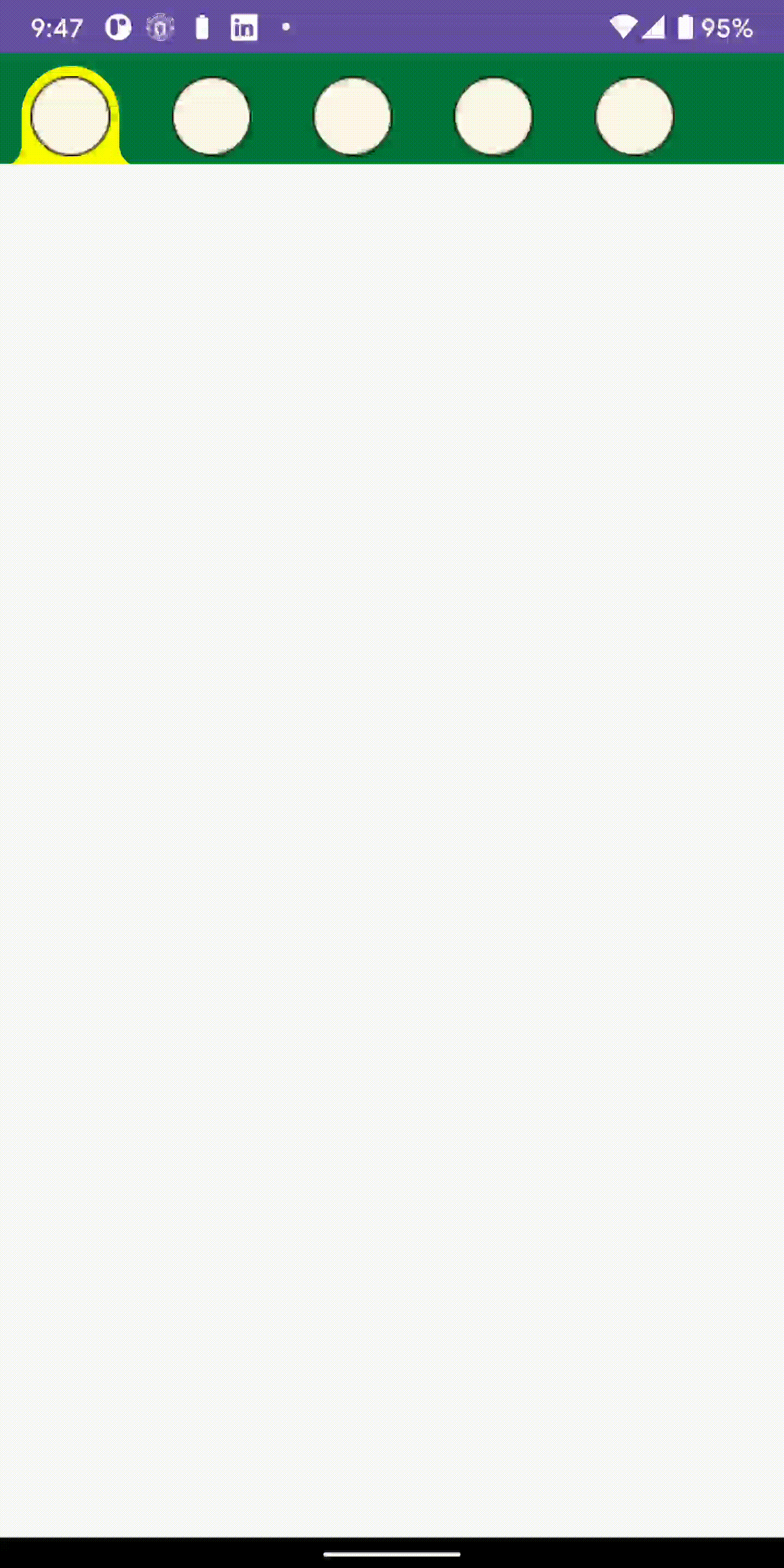
结果

演示
@Preview
@Composable
private fun Test() {
    CropBar() {

    }
}

@Composable
fun CropBar(onCropClicked: (Int) -> Unit) {
    Column {

        Spacer(modifier = Modifier.height(20.dp))
        var selectedIndex by remember { mutableStateOf(0) }
        val pages = listOf("kotlin", "java", "c#", "php", "golang", "A", "B", "C")
        val colors = listOf(Color.Yellow, Color.Red, Color.White, Color.Blue, Color.Magenta)

        val indicator = @Composable { tabPositions: List<TabPosition> ->
            val color = when (selectedIndex) {
                0 -> colors[0]
                1 -> colors[1]
                2 -> colors[2]
                3 -> colors[3]
                else -> colors[4]
            }
            CustomIndicator(tabPositions = tabPositions, selectedIndex = selectedIndex, color)
        }
        MyScrollableTabRow(
            modifier = Modifier
                .fillMaxWidth()
                .height(58.dp),
            selectedTabIndex = selectedIndex,
            backgroundColor = Color(0xFF03753C),
            indicator = indicator,
            edgePadding = 0.dp,
            divider = {
            },

            ) {
            pages.forEachIndexed { index, title ->

                Tab(
                    modifier = Modifier
                        .height(58.dp)
                        .width(74.dp)
                        .zIndex(2f),
                    selected = selectedIndex == index,
                    onClick = {
                        selectedIndex = index
                        onCropClicked(index)
                    },
                    interactionSource = NoRippleInteractionSource()
                ) {

                    SampleImage(selectedIndex)
                }
            }
        }

        Spacer(modifier = Modifier.height(20.dp))

        MyScrollableTabRow(
            modifier = Modifier
                .fillMaxWidth()
                .height(58.dp),
            selectedTabIndex = selectedIndex,
            backgroundColor = Color(0xFF03753C),
            indicator = indicator,
            minItemWidth = 0.dp,
            edgePadding = 0.dp,
            divider = {
            },

            ) {
            pages.forEachIndexed { index, title ->

                Tab(
                    modifier = Modifier
                        .height(58.dp)
                        .width(74.dp)
                        .zIndex(2f),
                    selected = selectedIndex == index,
                    onClick = {
                        selectedIndex = index
                        onCropClicked(index)
                    },
                    interactionSource = NoRippleInteractionSource()
                ) {

                    SampleImage(selectedIndex)
                }
            }
        }
    }
}
实施
@Composable
@UiComposable
fun MyScrollableTabRow(
    selectedTabIndex: Int,
    modifier: Modifier = Modifier,
    minItemWidth:Dp =ScrollableTabRowMinimumTabWidth,
    backgroundColor: Color = MaterialTheme.colors.primarySurface,
    contentColor: Color = contentColorFor(backgroundColor),
    edgePadding: Dp = TabRowDefaults.ScrollableTabRowPadding,
    indicator: @Composable @UiComposable
        (tabPositions: List<TabPosition>) -> Unit = @Composable { tabPositions ->
        TabRowDefaults.Indicator(
            Modifier.tabIndicatorOffset(tabPositions[selectedTabIndex])
        )
    },
    divider: @Composable @UiComposable () -> Unit =
        @Composable {
            TabRowDefaults.Divider()
        },
    tabs: @Composable @UiComposable () -> Unit
) {
    Surface(
        modifier = modifier,
        color = backgroundColor,
        contentColor = contentColor
    ) {
        val scrollState = rememberScrollState()
        val coroutineScope = rememberCoroutineScope()
        val scrollableTabData = remember(scrollState, coroutineScope) {
            ScrollableTabData(
                scrollState = scrollState,
                coroutineScope = coroutineScope
            )
        }
        SubcomposeLayout(
            Modifier.fillMaxWidth()
                .wrapContentSize(align = Alignment.CenterStart)
                .horizontalScroll(scrollState)
                .selectableGroup()
                .clipToBounds()
        ) { constraints ->

            // ? Change this to 0 or
            val minTabWidth = minItemWidth.roundToPx()
            val padding = edgePadding.roundToPx()
            // ?or use constraints to measure each tab with its own width or
            // a another value instead of them having at least 90.dp
            val tabConstraints = constraints.copy(minWidth = minTabWidth)

            val tabPlaceables = subcompose(com.smarttoolfactory.tutorial1_1basics.chapter6_graphics.TabSlots.Tabs, tabs)
                .map { it.measure(tabConstraints) }

            var layoutWidth = padding * 2
            var layoutHeight = 0
            tabPlaceables.forEach {
                layoutWidth += it.width
                layoutHeight = maxOf(layoutHeight, it.height)
            }

            // Position the children.
            layout(layoutWidth, layoutHeight) {
                // Place the tabs
                val tabPositions = mutableListOf<TabPosition>()
                var left = padding
                tabPlaceables.forEach {
                    it.placeRelative(left, 0)
                    tabPositions.add(TabPosition(left = left.toDp(), width = it.width.toDp()))
                    left += it.width
                }

                // The divider is measured with its own height, and width equal to the total width
                // of the tab row, and then placed on top of the tabs.
                subcompose(com.smarttoolfactory.tutorial1_1basics.chapter6_graphics.TabSlots.Divider, divider).forEach {
                    val placeable = it.measure(
                        constraints.copy(
                            minHeight = 0,
                            minWidth = layoutWidth,
                            maxWidth = layoutWidth
                        )
                    )
                    placeable.placeRelative(0, layoutHeight - placeable.height)
                }

                // The indicator container is measured to fill the entire space occupied by the tab
                // row, and then placed on top of the divider.
                subcompose(com.smarttoolfactory.tutorial1_1basics.chapter6_graphics.TabSlots.Indicator) {
                    indicator(tabPositions)
                }.forEach {
                    it.measure(Constraints.fixed(layoutWidth, layoutHeight)).placeRelative(0, 0)
                }

                scrollableTabData.onLaidOut(
                    density = this@SubcomposeLayout,
                    edgeOffset = padding,
                    tabPositions = tabPositions,
                    selectedTab = selectedTabIndex
                )
            }
        }
    }
}

@Immutable
class TabPosition internal constructor(val left: Dp, val width: Dp) {
    val right: Dp get() = left + width

    override fun equals(other: Any?): Boolean {
        if (this === other) return true
        if (other !is TabPosition) return false

        if (left != other.left) return false
        if (width != other.width) return false

        return true
    }

    override fun hashCode(): Int {
        var result = left.hashCode()
        result = 31 * result + width.hashCode()
        return result
    }

    override fun toString(): String {
        return "TabPosition(left=$left, right=$right, width=$width)"
    }
}

object TabRowDefaults {
    /**
     * Default [Divider], which will be positioned at the bottom of the [TabRow], underneath the
     * indicator.
     *
     * @param modifier modifier for the divider's layout
     * @param thickness thickness of the divider
     * @param color color of the divider
     */
    @Composable
    fun Divider(
        modifier: Modifier = Modifier,
        thickness: Dp = DividerThickness,
        color: Color = LocalContentColor.current.copy(alpha = DividerOpacity)
    ) {
        androidx.compose.material.Divider(modifier = modifier, thickness = thickness, color = color)
    }

    /**
     * Default indicator, which will be positioned at the bottom of the [TabRow], on top of the
     * divider.
     *
     * @param modifier modifier for the indicator's layout
     * @param height height of the indicator
     * @param color color of the indicator
     */
    @Composable
    fun Indicator(
        modifier: Modifier = Modifier,
        height: Dp = IndicatorHeight,
        color: Color = LocalContentColor.current
    ) {
        Box(
            modifier
                .fillMaxWidth()
                .height(height)
                .background(color = color)
        )
    }

    /**
     * [Modifier] that takes up all the available width inside the [TabRow], and then animates
     * the offset of the indicator it is applied to, depending on the [currentTabPosition].
     *
     * @param currentTabPosition [TabPosition] of the currently selected tab. This is used to
     * calculate the offset of the indicator this modifier is applied to, as well as its width.
     */
    fun Modifier.tabIndicatorOffset(
        currentTabPosition: TabPosition
    ): Modifier = composed(
        inspectorInfo = debugInspectorInfo {
            name = "tabIndicatorOffset"
            value = currentTabPosition
        }
    ) {
        val currentTabWidth by animateDpAsState(
            targetValue = currentTabPosition.width,
            animationSpec = tween(durationMillis = 250, easing = FastOutSlowInEasing)
        )
        val indicatorOffset by animateDpAsState(
            targetValue = currentTabPosition.left,
            animationSpec = tween(durationMillis = 250, easing = FastOutSlowInEasing)
        )
        fillMaxWidth()
            .wrapContentSize(Alignment.BottomStart)
            .offset(x = indicatorOffset)
            .width(currentTabWidth)
    }

    /**
     * Default opacity for the color of [Divider]
     */
    const val DividerOpacity = 0.12f

    /**
     * Default thickness for [Divider]
     */
    val DividerThickness = 1.dp

    /**
     * Default height for [Indicator]
     */
    val IndicatorHeight = 2.dp

    /**
     * The default padding from the starting edge before a tab in a [ScrollableTabRow].
     */
    val ScrollableTabRowPadding = 52.dp
}

private enum class TabSlots {
    Tabs,
    Divider,
    Indicator
}

/**
 * Class holding onto state needed for [ScrollableTabRow]
 */
private class ScrollableTabData(
    private val scrollState: ScrollState,
    private val coroutineScope: CoroutineScope
) {
    private var selectedTab: Int? = null

    fun onLaidOut(
        density: Density,
        edgeOffset: Int,
        tabPositions: List<TabPosition>,
        selectedTab: Int
    ) {
        // Animate if the new tab is different from the old tab, or this is called for the first
        // time (i.e selectedTab is `null`).
        if (this.selectedTab != selectedTab) {
            this.selectedTab = selectedTab
            tabPositions.getOrNull(selectedTab)?.let {
                // Scrolls to the tab with [tabPosition], trying to place it in the center of the
                // screen or as close to the center as possible.
                val calculatedOffset = it.calculateTabOffset(density, edgeOffset, tabPositions)
                if (scrollState.value != calculatedOffset) {
                    coroutineScope.launch {
                        scrollState.animateScrollTo(
                            calculatedOffset,
                            animationSpec = ScrollableTabRowScrollSpec
                        )
                    }
                }
            }
        }
    }

    /**
     * @return the offset required to horizontally center the tab inside this TabRow.
     * If the tab is at the start / end, and there is not enough space to fully centre the tab, this
     * will just clamp to the min / max position given the max width.
     */
    private fun TabPosition.calculateTabOffset(
        density: Density,
        edgeOffset: Int,
        tabPositions: List<TabPosition>
    ): Int = with(density) {
        val totalTabRowWidth = tabPositions.last().right.roundToPx() + edgeOffset
        val visibleWidth = totalTabRowWidth - scrollState.maxValue
        val tabOffset = left.roundToPx()
        val scrollerCenter = visibleWidth / 2
        val tabWidth = width.roundToPx()
        val centeredTabOffset = tabOffset - (scrollerCenter - tabWidth / 2)
        // How much space we have to scroll. If the visible width is <= to the total width, then
        // we have no space to scroll as everything is always visible.
        val availableSpace = (totalTabRowWidth - visibleWidth).coerceAtLeast(0)
        return centeredTabOffset.coerceIn(0, availableSpace)
    }
}

private val ScrollableTabRowMinimumTabWidth = 90.dp

/**
 * [AnimationSpec] used when scrolling to a tab that is not fully visible.
 */
private val ScrollableTabRowScrollSpec: AnimationSpec<Float> = tween(
    durationMillis = 250,
    easing = FastOutSlowInEasing
)