目前,我的表格在桌面上看起来和我想要的一样.下面的例子

enter image description here

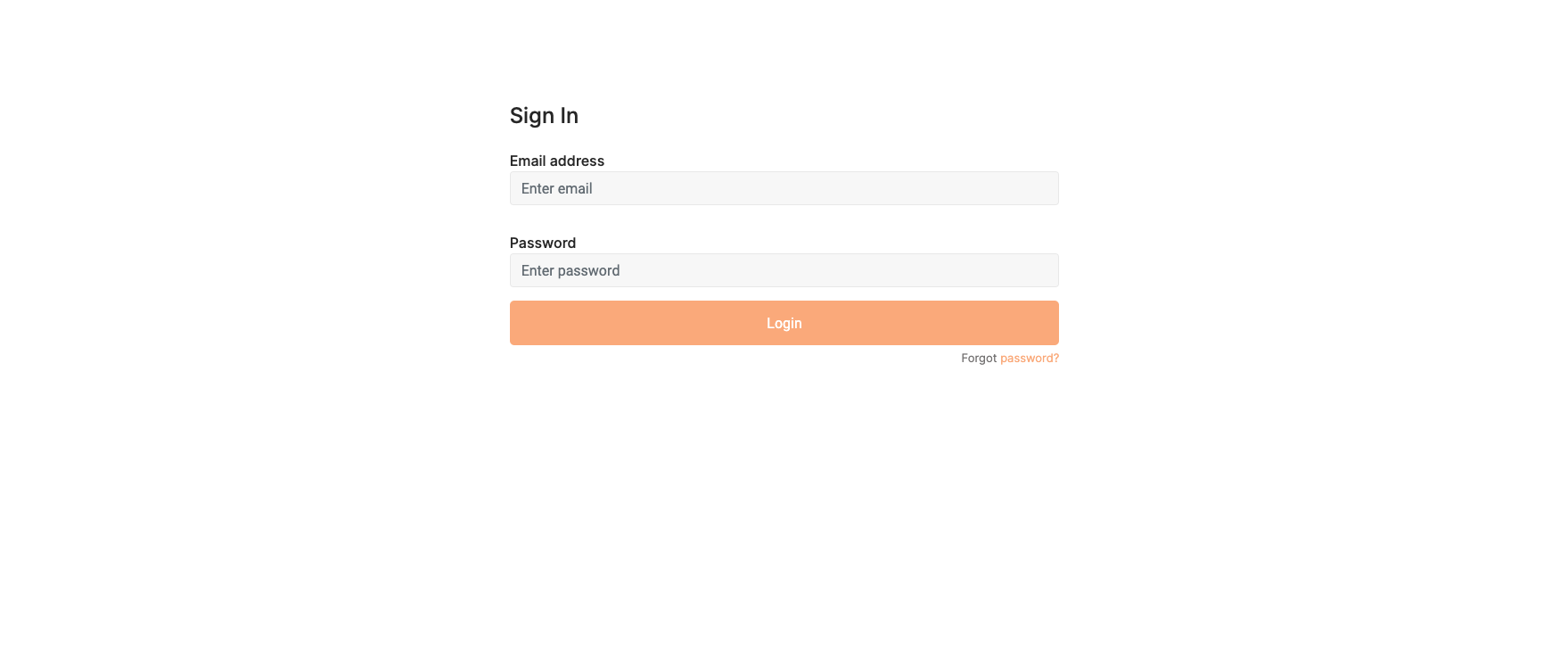
然而,当在移动设备上压缩时,表单域看起来太紧了

enter image description here

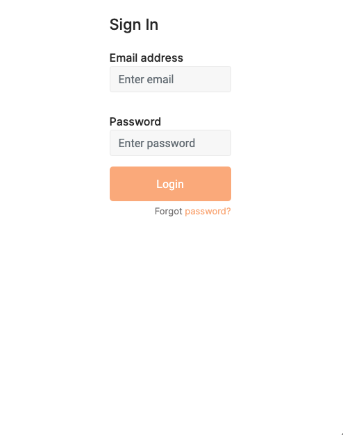
如何更好地控制表单字段在移动设备上的显示(宽度).这也是媒体查询,还是我的代码中有什么错误导致在移动设备上表单字段宽度变得太紧?

@import url('https://fonts.googleapis.com/css?family=Inter:400,500,600,700,800,900');
* {
  box-sizing: border-box;
}

.padding {
  background: #f0f0f0 !important;
  min-height: 100vh;
  display: flex;
  font-weight: 400;
  font-family: 'Inter';
  -left: 20vw;
  min-width: 100%;
}

h2,
h3,
h4,
h5,
h6,
label,
span {
  font-weight: 500;
  font-family: 'inter';
}

body,
html,
.App,
#root,
.auth-wrapper {
  width: 100%;
  height: 100%;
}

p {
  font-family: Inter;
  font-style: normal;
  font-weight: normal;
  font-size: 18px;
  line-height: 28px;
  color: #939599;
}

h1 {
  font-family: Inter;
  font-weight: 800;
  font-size: 24px;
  line-height: 40px;
  color: #494D61;
}

.navbar-light {
  background-color: #ffffff;
}

.Logo {
  margin-top: 2vh;
}

.auth-wrapper {
  display: flex;
  justify-content: center;
  flex-direction: column;
  text-align: left;
  background: #ffffff;
  margin: 8vw 0;
  position: center;
  align-items: center;
  justify-content: center;
}

.auth-inner {
  width: 1000px;
  margin: auto;
  background: #ffffff;
  margin: 40px 55px 45px 55px;
  border-radius: 15px;
  transition: all .3s;
  display: flex;
  align-items: center;
  justify-content: center;
}

.auth-wrapper .form-control:focus {
  border-color: #FBB381;
  box-shadow: none;
}

.auth-wrapper .form-control {
  background-color: #F8F8F8;
  border-color: #EBEBEB;
}

.auth-wrapper h3 {
  text-align: center;
  margin: 0;
  line-height: 1;
  margin-bottom: 20px;
}

.custom-control-label {
  font-weight: 400;
}

.forgot-password,
.forgot-password a {
  text-align: right;
  font-size: 13px;
  margin-top: 10px;
  color: #7f7d7d;
  margin: 0;
}

.forgot-password a {
  color: #FBB381;
}

.form-group:not(:nth-of-type(1)) {
  margin: 5px 0;
}

.form-signup {
  display: grid;
  /* to use css-grid */
  grid-template-columns: 1fr 1fr;
  /* creates 2 columns */
  gap: 10px 50px;
  /* creates a gap between the columns and rows */
}

.form-login {
  display: flex;
  /* to use css-grid */
  width: 35vw;
  gap: 10px 50px;
  /* creates a gap between the columns and rows */
}

form.form-login .login>div.form-group {
  margin: 15px 0px;
}

form h3,
form h4,
form p,
form button {
  grid-column: span 2;
  /* lets those elements span both columns */
}

.signup-button {
  grid-column: span 2;
  /* lets those elements span both columns */
  background-color: #FBB381;
  border-radius: 5px;
  border: #FBB381;
  height: 50px;
  color: white
}

.login {
  display: flex;
  flex-direction: column;
  width: 75vw;
  /* flexbox is sued to palce the label and input below each other and allows the input to fill out the entrie width */
}

.button {
  background-color: #FBB381;
  border-radius: 5px;
  border: #FBB381;
  height: 50px;
  color: white;
}

.login-button {
  background-color: #FBB381;
  border-radius: 5px;
  border: #FBB381;
  height: 50px;
  color: white;
  margin-top: 15px;
  border-radius: 5px;
}

.sidebar-container {
  min-height: 100vh;
  background-color: lightgray;
}

.sidebar {
  padding-top: 15px;
}

.sidebar-link {
  padding: 0px;
}

.sidebar-link:hover {
  border-right: 5px solid #FBB381;
  background-color: gainsboro;
}
import React, { Component } from "react"; import TopNav from "./TopNav" export default class Login extends Component { render() { return (

<div>
  <TopNav />

  <div className="auth-wrapper">
    <div className="auth-inner">
      <form className="form-login">

        <div className="login">
          <h4>Sign In</h4>
          <div className="form-group">
            <label>Email address</label>
            <input type="email" className="form-control" placeholder="Enter email" />
          </div>
          <div className="form-group">
            <label>Password</label>
            <input type="password" className="form-control" placeholder="Enter password" />

          </div>


          <button type="submit" className="button">Login</button>
          <p className="forgot-password text-right">
            Forgot <a href="/">password?</a>
          </p>
        </div>
      </form>
    </div>
  </div>
</div>
); } }

推荐答案

另外,您可以为不同的尺寸使用media-queries.我从您的CSS(.auth-innerhtml,body,.auth-wrapper ...)和HTML中删除了一些代码:

@import url('https://fonts.googleapis.com/css?family=Inter:400,500,600,700,800,900');
* {
  box-sizing: border-box;
}

.padding {
  background: #f0f0f0 !important;
  min-height: 100vh;
  display: flex;
  font-weight: 400;
  font-family: 'Inter';
  -left: 20vw;
  min-width: 100%;
}

h2,
h3,
h4,
h5,
h6,
label,
span {
  font-weight: 500;
  font-family: 'inter';
}
/*
body,
html,
.App,
#root,
.auth-wrapper {
  width: 100%;
  height: 100%;
} removed
*/ 
p {
  font-family: Inter;
  font-style: normal;
  font-weight: normal;
  font-size: 18px;
  line-height: 28px;
  color: #939599;
}

h1 {
  font-family: Inter;
  font-weight: 800;
  font-size: 24px;
  line-height: 40px;
  color: #494D61;
}

.navbar-light {
  background-color: #ffffff;
}

.Logo {
  margin-top: 2vh;
}

.auth-wrapper {
  display: flex;
  justify-content: center;
  flex-direction: column;
  text-align: left;
  background: #ffffff;
  margin: 8vw 0;
  position: center;
  align-items: center;
  justify-content: center;
}

.auth-inner {
  /* width: 1000px; removed */
  margin: auto;
  background: #ffffff;
  margin: 40px 55px 45px 55px;
  border-radius: 15px;
  transition: all .3s;
  display: flex;
  align-items: center;
  justify-content: center;
}

.auth-wrapper .form-control:focus {
  border-color: #FBB381;
  box-shadow: none;
}

.auth-wrapper .form-control {
  background-color: #F8F8F8;
  border-color: #EBEBEB;
}

.auth-wrapper h3 {
  text-align: center;
  margin: 0;
  line-height: 1;
  margin-bottom: 20px;
}

.custom-control-label {
  font-weight: 400;
}

.forgot-password,
.forgot-password a {
  text-align: right;
  font-size: 13px;
  margin-top: 10px;
  color: #7f7d7d;
  margin: 0;
}

.forgot-password a {
  color: #FBB381;
}

.form-group:not(:nth-of-type(1)) {
  margin: 5px 0;
}

.form-signup {
  display: grid;
  /* to use css-grid */
  grid-template-columns: 1fr 1fr;
  /* creates 2 columns */
  gap: 10px 50px;
  /* creates a gap between the columns and rows */
}

.form-login {
  display: flex;
  /* to use css-grid */
  width: 35vw;
  gap: 10px 50px;
  /* creates a gap between the columns and rows */
}

form.form-login .login>div.form-group {
  margin: 15px 0px;
}

form h3,
form h4,
form p,
form button {
  grid-column: span 2;
  /* lets those elements span both columns */
}

.signup-button {
  grid-column: span 2;
  /* lets those elements span both columns */
  background-color: #FBB381;
  border-radius: 5px;
  border: #FBB381;
  height: 50px;
  color: white
}

.login {
  display: flex;
  flex-direction: column;
  width: 75vw;
  /* flexbox is sued to palce the label and input below each other and allows the input to fill out the entrie width */
}

.button {
  background-color: #FBB381;
  border-radius: 5px;
  border: #FBB381;
  height: 50px;
  color: white;
}

.login-button {
  background-color: #FBB381;
  border-radius: 5px;
  border: #FBB381;
  height: 50px;
  color: white;
  margin-top: 15px;
  border-radius: 5px;
}

.sidebar-container {
  min-height: 100vh;
  background-color: lightgray;
}

.sidebar {
  padding-top: 15px;
}

.sidebar-link {
  padding: 0px;
}

.sidebar-link:hover {
  border-right: 5px solid #FBB381;
  background-color: gainsboro;
}

@media screen and (max-width: 900px){
    .form-login{
        width: 50vw;
    }
}
@media screen and (max-width: 600px){
    .form-login{
        width: 70vw;
    }
}
@media screen and (max-width: 400px){
    .form-login{
        width: 90vw;
    }
}
<div>
  <div class="auth-wrapper">
    <div class="auth-inner">
      <form class="form-login">

        <div class="login">
          <h4>Sign In</h4>
          <div class="form-group">
            <label>Email address</label>
            <input type="email" class="form-control" placeholder="Enter email" />
          </div>
          <div class="form-group">
            <label>Password</label>
            <input type="password" class="form-control" placeholder="Enter password" />

          </div>


          <button type="submit" class="button">Login</button>
          <p class="forgot-password text-right">
            Forgot <a href="/">password?</a>
          </p>
        </div>
      </form>
    </div>
  </div>
</div>

Html相关问答推荐

将多个内联元素置于中心,而无需访问父级上的CSS

如何在图像中垂直和水平居中显示文本?

为什么不是所有字体好的图标都能与boostRapCDN一起使用呢?

如何突破安莉得分

高度:适合-内容不拉伸以适合内部长度

如果最后一行的卡数少于其他行,则在使用flex grow使卡在调整大小时拉伸后,flex卡的宽度将被拉伸

当div位于flexbox中时,如何使div的宽度与高度相同

并排放置两个 div,同时 div2 环绕 div1

对齐列表项内的文本,使其不在元素装饰下

发送带有图像的Google文档作为HTML格式的邮件正文不再起作用

不完整的悬停

在带有换行文本的工具提示中显示溢出文本

用于表行组标题的正确 HTML 标记是什么?

XPATH Select h2标签和

标签之间或h2标签和 标签之间的td元素,以立即为准

如何将 2 种不同的 colored颜色 应用于 css 中的复选框?

浮动元素忽略 margin-top 属性后的块元素

基本上,我想要两列包含文本和图像,但第二列是倒置的

如何使文本显示在页眉/页脚之外?

有没有办法在 CSS 类子句中指定多个 HTML 元素?

我正在创建一个 django 审查系统.我认为我的 HTML 是错误的