我想要有相等元素的截面面积.一边是图像,另一边是内容.我使用的是Tailwind CSS,我觉得自己有正确的课程.section div被声明为Flex,而子元素的Flex base为0,Flex grow为1.content div仍然比image div大一点.
<section class="section-one flex flex-col-reverse md:flex-row-reverse">
<div class="basis-0 grow p-6 text-center md:text-left md:flex md:flex-col md:justify-center md:items-center">
<div>
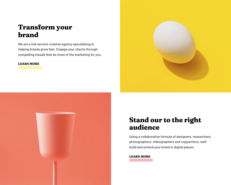
<h2 class="font-fraunces text-4xl mb-4 md:text-left md:max-w-md">Stand our to the right audience</h2>
<p class="font-barlow text-gray-500 text-lg p-4 mb-6 md:max-w-md md:p-0">Using a collaborative formula of designers, researchers, photographers, videographers and copywriters, we'll build and extend your brand in digital places.</p>
<div class="flex flex-col">
<a href="#" class="font-fraunces uppercase z-1">Learn More</a>
<span class="bg-rose-300/75 w-32 mx-auto h-4 rounded-full md:m-0"></span>
</div>
</div>
</div>
<div class="basis-0 grow">
<img src="images/desktop/image-stand-out.jpg" alt="" class="w-full" />
</div>
</section>