- 入门教程
- 进阶教程
- 基本组件
 《Flutter入门教程》
Flutter - Progress

进度条是图形控制元素,用于显示任务的进度,例如下载,上载,安装,文件传输等。在本节中,无涯教程将了解如何在Flutter应用程序中显示进度条。
Flutter可以在两个小部件的帮助下显示进度条,如下所示:
让无涯教程详细了解。
LinearProgressIndicator
线性进度条用于以水平线显示任务的进度。
Flutter主要提供两种类型的线性进度指示器:
Daterminate - 确定进度条指示执行任务时每个点的实际进度。它的值将从0.0单调增加到1.0,以显示当时已完成的任务量。无涯教程需要使用0.0到1.0之间的非空值来创建确定的进度指示器。
Indeterminate - 不确定的进度条不指示完成任务的进度。这意味着无涯教程不知道任务何时完成。它取得了进展,但没有指出还剩下多少进展。无涯教程可以通过使用null值来确定不确定的进度指示器。
属性
以下是线性进度指示器的最常见属性:
double value - 它用于指定0.0到1.0之间的非空值,表示完成任务进度。
Color backgroundColor - 它用于指定窗口小部件的背景颜色。
Animation<Color> valueColor - 用于将进度指示器的颜色指定为动画值。
例子
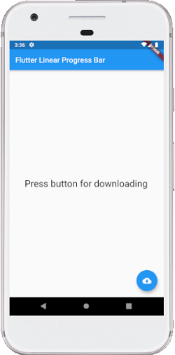
以下代码说明了不确定的线性进度条的用法,该进度条显示了一个下载,无涯教程不知道何时完成下载。浮动按钮用于将状态从未下载更改为下载。当没有下载时,它会显示一个文本。否则,它将显示进度指示器:
import 'package:flutter/material.dart'; void main() => runApp(MyApp()); class MyApp extends StatelessWidget { @override Widget build(BuildContext context) { return MaterialApp( home: linearprogressinicator.App(), ); } } class linearprogressinicator.App extends StatefulWidget { @override StatecreateState() { return linearprogressinicator.AppState(); } } class linearprogressinicator.AppState extends State { bool _loading; @override void initState() { super.initState(); _loading = false; } @override Widget build(BuildContext context) { return Scaffold( appBar: AppBar( title: Text("Flutter Linear Progress Bar"), ), body: Center( child: Container( padding: EdgeInsets.all(12.0), child: _loading ? linearprogressinicator.() : Text( "Press button for downloading", style: TextStyle(fontSize: 25)), ), ), floatingActionButton: FloatingActionButton( onPressed: () { setState(() { _loading = !_loading; }); }, tooltip: 'Download', child: Icon(Icons.cloud_download), ), ); } }
现在,在IDE中运行应用程序。无涯教程可以看到屏幕的UI如下屏幕截图。
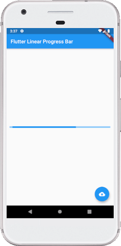
当无涯教程按下浮动按钮时,它会改变状态从未下载到下载,并显示以下屏幕截图的进度指示符:
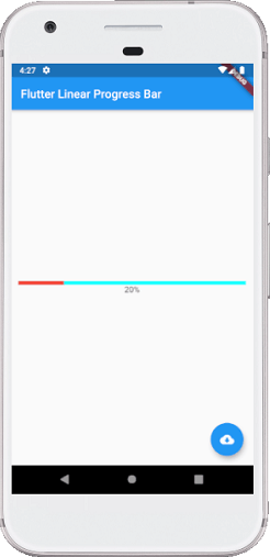
有时,无涯教程想制作一个确定的进度条,这意味着无涯教程将显示完成任务将花费多长时间。在这种情况下,无涯教程可以模拟一次下载,这将花费一些时间来完成任务并更新linearprogressinicator的值。如下:
import 'dart:async'; import 'package:flutter/material.dart'; void main() => runApp(MyApp()); class MyApp extends StatelessWidget { @override Widget build(BuildContext context) { return MaterialApp( home: linearprogressinicator.App(), ); } } class linearprogressinicator.App extends StatefulWidget { @override StatecreateState() { return linearprogressinicator.AppState(); } } class linearprogressinicator.AppState extends State { bool _loading; double _progressValue; @override void initState() { super.initState(); _loading = false; _progressValue = 0.0; } @override Widget build(BuildContext context) { return Scaffold( appBar: AppBar( title: Text("Flutter Linear Progress Bar"), ), body: Center( child: Container( padding: EdgeInsets.all(12.0), child: _loading ? Column( mainAxisAlignment: MainAxisAlignment.center, children: [ linearprogressinicator.( backgroundColor: Colors.cyanAccent, valueColor: new AlwaysStoppedAnimation (Colors.red), value: _progressValue, ), Text('${(_progressValue * 100).round()}%'), ], ) : Text("Press button for downloading", style: TextStyle(fontSize: 25)), ), ), floatingActionButton: FloatingActionButton( onPressed: () { setState(() { _loading = !_loading; _updateProgress(); }); }, tooltip: 'Download', child: Icon(Icons.cloud_download), ), ); } //此函数更新进度值 void _updateProgress() { const oneSec = const Duration(seconds: 1); new Timer.periodic(oneSec, (Timer t) { setState(() { _progressValue += 0.1; //我们在这里“完成”下载 if (_progressValue.toStringAsFixed(1) == '1.0') { _loading = false; t.cancel(); return; } }); }); } }
现在,在IDE中运行应用程序。当无涯教程按下按钮时,它会从未下载到下载时更改状态,并显示此时的进度如下如下屏幕截图:
CircularProgressIndicator
它是一个小部件,可旋转以指示您的应用程序中的等待过程。它以圆形显示任务的进度。它还以两种方式显示进度条:Determinate和Indeterminate。
当无涯教程要显示正在进行的任务的进度(例如下载或上传文件的百分比等)时,使用已定(Determinate)的进度条。无涯教程可以通过指定0.0到1.0之间的值来显示进度。
当无涯教程不想知道正在进行的过程的百分比时,使用不定(Indeterminate)的进度条。默认情况下,CircularProgressIndicator显示不确定的进度栏。
例子
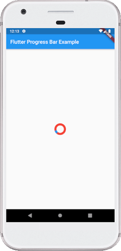
在下面的示例中,无涯教程将以不确定的模式看到循环进度指示器,该模式不显示任何任务的进度。它连续显示圆圈,表明正在处理某些内容,无涯教程必须等待其完成。为此,无需为CircularProgressIndicator()构造函数指定任何值。请参见以下代码:
import 'package:flutter/material.dart';

void main() => runApp(MyApp());

class MyApp extends StatelessWidget {
  @override
  Widget build(BuildContext context) {
    return MaterialApp(
      home: Scaffold(
        appBar: AppBar(
          title: Text('Flutter Progress Bar Example'),
        ),
        body: Center(
            child: CircularProgressinicator.App()
        ),
      ),
    );
  }
}

///这是主应用程序实例化的无状态小部件。
class CircularProgressinicator.App extends StatelessWidget {
  @override
  Widget build(BuildContext context) {
    return CircularProgressinicator.(
      backgroundColor: Colors.red,
      strokeWidth: 8,);
  }
}
现在,在IDE中运行应用程序。无涯教程将看到像下面的屏幕截图这样的Flutter循环进度指示器的输出:
有时您想制作一个确定的圆形进度条,以显示完成任务将花费多少时间。在这种情况下,无涯教程可以模拟一次下载,这将花费一些时间来完成任务并更新CircularProgressinicator的值。如下:
import 'dart:async'; import 'package:flutter/material.dart'; void main() => runApp(MyApp()); class MyApp extends StatelessWidget { @override Widget build(BuildContext context) { return MaterialApp( home: CircularProgressinicator.App(), ); } } class CircularProgressinicator.App extends StatefulWidget { @override StatecreateState() { return CircularProgressinicator.AppState(); } } class CircularProgressinicator.AppState extends State { bool _loading; double _progressValue; @override void initState() { super.initState(); _loading = false; _progressValue = 0.0; } @override Widget build(BuildContext context) { return Scaffold( appBar: AppBar( title: Text("Flutter Circular Progress Bar"), ), body: Center( child: Container( padding: EdgeInsets.all(14.0), child: _loading ? Column( mainAxisAlignment: MainAxisAlignment.center, children: [ CircularProgressinicator.( strokeWidth: 10, backgroundColor: Colors.yellow, valueColor: new AlwaysStoppedAnimation (Colors.red), value: _progressValue, ), Text('${(_progressValue * 100).round()}%'), ], ) : Text("Press button for downloading", style: TextStyle(fontSize: 25)), ), ), floatingActionButton: FloatingActionButton( onPressed: () { setState(() { _loading = !_loading; _updateProgress(); }); }, child: Icon(Icons.cloud_download), ), ); } //此函数更新进度值 void _updateProgress() { const oneSec = const Duration(seconds: 1); new Timer.periodic(oneSec, (Timer t) { setState(() { _progressValue += 0.2; //我们在这里“完成”下载 if (_progressValue.toStringAsFixed(1) == '1.0') { _loading = false; t.cancel(); return; } }); }); } }
现在,在IDE中运行应用程序。当无涯教程按下按钮时,它会显示当时的屏幕截图的那一次完成了多少进度:

祝学习愉快!(内容编辑有误?请选中要编辑内容 -> 右键 -> 修改 -> 提交!)