- 基础教程
- 高级教程
- 布局教程
- 基础教程
- Flexbox布局
 《CSS入门教程》
Flexbox - flex-wrap属性

通常,在集合空间不足的情况下,其余的flex项目将被隐藏,如下所示。
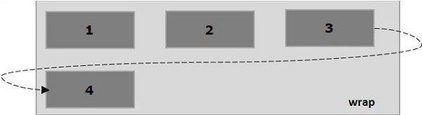
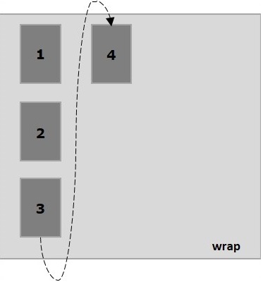
flex-wrap 属性用于指定控件,其中flex集合是单行还是多行。
用法-
链接:https://www.learnfk.comhttps://www.learnfk.com/css/flexbox-flex-wrap.html
来源:LearnFk无涯教程网
flex-wrap: nowrap | wrap | wrap-reverse
flex-direction: column | column-reverse
此属性接受以下值-
wrap - 如果没有足够的空间时,则换行。
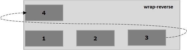
wrap-reverse - 如果没有足够的空间时,则向上换行。
现在,无涯教程将通过示例了解如何使用 wrap 属性。
Wrap示例
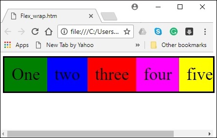
将值 wrap 传递给属性 flex-wrap 时,集合的元素从左到右水平排列,如下所示。
下面的示例演示将值 wrap 传递给 flex-wrap 属性的输出。在这里创建了六个具有不同颜色的框,它们的 flex-direction 值 row 。
<!doctype html>
<html lang="en">
   <style>
      .box1{background:green;}
      .box2{background:blue;}
      .box3{background:red;}
      .box4{background:magenta;}
      .box5{background:yellow;}
      .box6{background:pink;}

      .box{
         font-size:35px;
         padding:15px;
         width:100px;
      }
      .container{
         display:flex;
         border:3px solid black;
         flex-direction:row;
         flex-wrap:wrap;
      }
   </style>

   <body>
      <div class="container">
         <div class="box box1">One</div>
         <div class="box box2">two</div>
         <div class="box box3">three</div>
         <div class="box box4">four</div>
         <div class="box box5">five</div>
         <div class="box box6">six</div>
      </div>
   </body>
</html>
它将产生以下输出-
Wrap-reverse示例
将值wrap-reverse 传递给属性flex-wrap时,集合的元素从左到右水平排列,如下所示。
以下示例演示了将值绕回传递给flex-wrap属性的输出。 在这里将使用flex-direction值行创建六个具有不同颜色的框。
<!doctype html>
<html lang="en">
   <style>
      .box1{background:green;}
      .box2{background:blue;}
      .box3{background:red;}
      .box4{background:magenta;}
      .box5{background:yellow;}
      .box6{background:pink;}

      .box{
         font-size:35px;
         padding:15px;
         width:100px;
      }
      .container{
         display:flex;
         border:3px solid black;
         flex-direction:row;
         flex-wrap:wrap-reverse;
      }
   </style>
   <body>
      <div class="container">
         <div class="box box1">One</div>
         <div class="box box2">two</div>
         <div class="box box3">three</div>
         <div class="box box4">four</div>
         <div class="box box5">five</div>
         <div class="box box6">six</div>
      </div>
   </body>
</html>
它将产生以下输出-
Wrap(column)示例
将值 wrap 传递给属性 flex-wrap 并将值 column 传递给属性 flex-direction 时,集合的元素从左到右水平排列,如下所示。
下面的示例演示将值 wrap 传递给 flex-wrap 属性的输出。在这里将创建六个具有 flex-direction 值 column 的不同颜色的框。
<!doctype html>
<html lang="en">
   <style>
      .box1{background:green;}
      .box2{background:blue;}
      .box3{background:red;}
      .box4{background:magenta;}
      .box5{background:yellow;}
      .box6{background:pink;}

      .box{
         font-size:35px;
         padding:15px;
         width:100px;
      }
      .container{
         display:flex;
         border:3px solid black;
         flex-direction:column;
         flex-wrap:wrap;
         height:100vh;
      }
   </style>

   <body>
      <div class="container">
         <div class="box box1">One</div>
         <div class="box box2">two</div>
         <div class="box box3">three</div>
         <div class="box box4">four</div>
         <div class="box box5">five</div>
         <div class="box box6">six</div>
      </div>
   </body>
</html>
它将产生以下输出-
Wrap-reverse (column)示例
在将值wrap-reverse传递到属性flex-wrap并将值列传递到属性flex-direction时,集合的元素从左到右水平排列,如下所示。
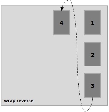
以下示例演示了将值wrap-reverse传递给flex-wrap属性的输出。 在这里将创建六个具有不同颜色的框,以及带有flex-direction值列的框。
<!doctype html>
<html lang="en">
   <style>
      .box1{background:green;}
      .box2{background:blue;}
      .box3{background:red;}
      .box4{background:magenta;}
      .box5{background:yellow;}
      .box6{background:pink;}

      .box{
         font-size:35px;
         padding:15px;
         width:100px;
      }
      .container{
         display:flex;
         border:3px solid black;
         flex-direction:column;
         flex-wrap:wrap-reverse;
         height:100vh;
      }
   </style>

   <body>
      <div class="container">
         <div class="box box1">One</div>
         <div class="box box2">two</div>
         <div class="box box3">three</div>
         <div class="box box4">four</div>
         <div class="box box5">five</div>
         <div class="box box6">six</div>
      </div>
   </body>
</html>
它将产生以下输出-
祝学习愉快!(内容编辑有误?请选中要编辑内容 -> 右键 -> 修改 -> 提交!)