- 基础教程
- 高级教程
- 布局教程
- 基础教程
- Flexbox布局
 《CSS入门教程》
Flexbox - align-content属性

如果flex集合有多行(当执行flex-wrap:wrap),则align-content属性定义集合中每行的对齐方式。
用法-
align-content: flex-start | flex-end | center | space-between | space-around | stretch;
此属性接受以下值-
stretch - 内容中的行将拉伸以填充剩余的空间。
flex-start - 内容中的所有行都在集合的开头。
flex-end - 内容中的所有行都包装在集合的末尾。
center - 内容中的所有行都在集合的中间。
space-between - 多余的空间均匀填充。
space-around - 多余的空间均匀分布在两行之间填充
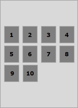
Center示例
将此值传递给属性align-content时,所有行都打包在集合的中心。
<!doctype html>
<html lang="en">
   <style>
      .box1{background:green;}
      .box2{background:blue;}
      .box3{background:red;}
      .box4{background:magenta;}
      .box5{background:yellow;}
      .box6{background:pink;}

      .box{
         font-size:25px;
         padding:15px;
         width:43%;
      }
      .container{
         display:flex;
         height:100vh;
         flex-wrap:wrap;
         align-content:center;
      }
   </style>

   <body>
      <div class="container">
         <div class="box box1">One</div>
         <div class="box box2">two</div>
         <div class="box box3">three</div>
         <div class="box box4">four</div>
         <div class="box box5">five</div>
         <div class="box box6">six</div>
      </div>
   </body>
</html>
它将产生以下输出-
链接:https://www.learnfk.comhttps://www.learnfk.com/css/flexbox-align-content.html
来源:LearnFk无涯教程网
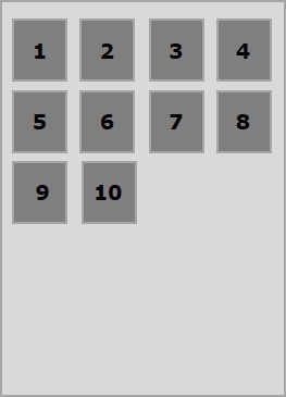
Flex-start示例
将此值传递给属性 align-content 时,所有行都在集合的开头。
<!doctype html>
<html lang="en">
   <style>
      .box1{background:green;}
      .box2{background:blue;}
      .box3{background:red;}
      .box4{background:magenta;}
      .box5{background:yellow;}
      .box6{background:pink;}

      .box{
         font-size:25px;
         padding:15px;
         width:40%;
      }
      .container{
         display:flex;
         height:100vh;
         flex-wrap:wrap;
         align-content:flex-start;
      }
   </style>

   <body>
      <div class="container">
         <div class="box box1">One</div>
         <div class="box box2">two</div>
         <div class="box box3">three</div>
         <div class="box box4">four</div>
         <div class="box box5">five</div>
         <div class="box box6">six</div>
      </div>
   </body>
</html>
它将产生以下输出-
链接:https://www.learnfk.comhttps://www.learnfk.com/css/flexbox-align-content.html
来源:LearnFk无涯教程网
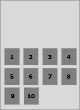
Flex-end示例
将此值传递给属性 align-content 时,所有行都打包在集合的末尾。
<!doctype html>
<html lang="en">
   <style>
      .box1{background:green;}
      .box2{background:blue;}
      .box3{background:red;}
      .box4{background:magenta;}
      .box5{background:yellow;}
      .box6{background:pink;}

      .box{
         font-size:25px;
         padding:15px;
         width:40%;
      }
      .container{
         display:flex;
         height:100vh;
         flex-wrap:wrap;
         align-content:flex-end;
      }
   </style>

   <body>
      <div class="container">
         <div class="box box1">One</div>
         <div class="box box2">two</div>
         <div class="box box3">three</div>
         <div class="box box4">four</div>
         <div class="box box5">five</div>
         <div class="box box6">six</div>
      </div>
   </body>
</html>
它将产生以下输出-
链接:https://www.learnfk.comhttps://www.learnfk.com/css/flexbox-align-content.html
来源:LearnFk无涯教程网
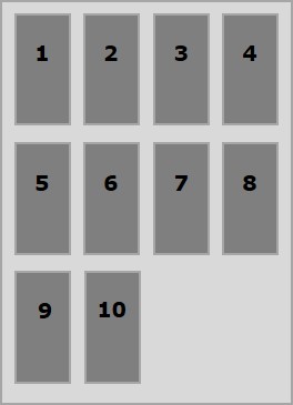
Stretch示例
在将此值传递给align-content属性时,这些行将逐渐缩小以填充剩余的空间。
<!doctype html>
<html lang="en">
   <style>
      .box1{background:green;}
      .box2{background:blue;}
      .box3{background:red;}
      .box4{background:magenta;}
      .box5{background:yellow;}
      .box6{background:pink;}

      .box{
         font-size:25px;
         padding:15px;
         width:40;
      }
      .container{
         display:flex;
         height:100vh;
         flex-wrap:wrap;
         align-content:stretch;
      }
   </style>

   <body>
      <div class="container">
         <div class="box box1">One</div>
         <div class="box box2">two</div>
         <div class="box box3">three</div>
         <div class="box box4">four</div>
         <div class="box box5">five</div>
         <div class="box box6">six</div>
      </div>
   </body>
</html>
它将产生以下输出-
链接:https://www.learnfk.comhttps://www.learnfk.com/css/flexbox-align-content.html
来源:LearnFk无涯教程网
Space-around示例
将此值传递给属性 align-content 时,多余的空间将均匀分布在两行之间,每行(包括第一行和最后一行)周围的空间相等。
<!doctype html>
<html lang="en">
   <style>
      .box1{background:green;}
      .box2{background:blue;}
      .box3{background:red;}
      .box4{background:magenta;}
      .box5{background:yellow;}
      .box6{background:pink;}

      .box{
         font-size:25px;
         padding:15px;
         width:40%;
      }
      .container{
         display:flex;
         height:100vh;
         flex-wrap:wrap;
         align-content:space-around;
      }
   </style>

   <body>
      <div class="container">
         <div class="box box1">One</div>
         <div class="box box2">two</div>
         <div class="box box3">three</div>
         <div class="box box4">four</div>
         <div class="box box5">five</div>
         <div class="box box6">six</div>
      </div>
   </body>
</html>
它将产生以下输出-
链接:https://www.learnfk.comhttps://www.learnfk.com/css/flexbox-align-content.html
来源:LearnFk无涯教程网
Space-between示例
将此值传递给属性 align-content 时,多余的空间将均匀地分布在两行之间,其中第一行将在集合的顶部,而最后一行将在集合的底部。
<!doctype html>
<html lang="en">
   <style>
      .box1{background:green;}
      .box2{background:blue;}
      .box3{background:red;}
      .box4{background:magenta;}
      .box5{background:yellow;}
      .box6{background:pink;}

      .box{
         font-size:25px;
         padding:15px;
         width:40%;
      }
      .container{
         display:flex;
         height:100vh;
         flex-wrap:wrap;
         align-content:space-between;
      }
   </style>

   <body>
      <div class="container">
         <div class="box box1">One</div>
         <div class="box box2">two</div>
         <div class="box box3">three</div>
         <div class="box box4">four</div>
         <div class="box box5">five</div>
         <div class="box box6">six</div>
      </div>
   </body>
</html>
它将产生以下输出-
链接:https://www.learnfk.comhttps://www.learnfk.com/css/flexbox-align-content.html
来源:LearnFk无涯教程网
祝学习愉快!(内容编辑有误?请选中要编辑内容 -> 右键 -> 修改 -> 提交!)