- 入门教程
 《Matplotlib入门教程》
 关注我们

Matplotlib - 小提琴图(Violin)
")
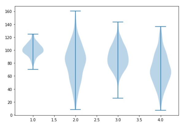
Violin图与箱形图相似,不同之处在于它们还显示了数据在不同值处的概率密度,在该箱形图上叠加了内核密度估计。像箱形图一样,Violin图用来表示跨不同"类别"的变量分布(或样本分布)的比较。
Violin图比普通箱图更具信息性。实际上,虽然箱形图仅显示汇总统计信息,如均值/中位数和四分位数范围,但Violin图却显示了数据的完整分布。
import matplotlib.pyplot as plt

np.random.seed(10)
collectn_1 = np.random.normal(100, 10, 200)
collectn_2 = np.random.normal(80, 30, 200)
collectn_3 = np.random.normal(90, 20, 200)
collectn_4 = np.random.normal(70, 25, 200)

## 将这些不同的集合组合成一个列表
data_to_plot = [collectn_1, collectn_2, collectn_3, collectn_4]

# 创建图形实例
fig = plt.figure()

# 创建坐标区实例
ax = fig.add_axes([0,0,1,1])

# 创建箱线图
bp = ax.violinplot(data_to_plot)
plt.show()
祝学习愉快!(内容编辑有误?请选中要编辑内容 -> 右键 -> 修改 -> 提交!)
好记忆不如烂笔头。留下您的足迹吧 :)