- 基础教程
- 高级教程
- 布局教程
- 基础教程
- Flexbox布局
 《CSS入门教程》
Flexbox - justify-content属性

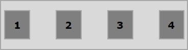
通常,如下图所示布置flex items后,您会发现集合中留有多余的空间。
使用属性 justify-content ,可以通过按预期分配额外的空间。您也可以调整flex-item的对齐方式,以防它们溢出。
用法-
justify-content: flex-start| flex-end| center | space-between | space-around| space-evenly;
此属性接受以下值-
flex-start - flex-item放置在集合的开头。
flex-end - flex-item放置在集合的末端。
center - flex-item位于集合的中心,多余的空间在 flex-item的开始和结尾处平均分配。
space-between - 多余的空间在 flex-item之间平均分配。
space-around - 多余的空间在 flex-item之间平均分配,以使集合边缘与其内容物之间的距离是 flex-item之间的距离的一半。
现在,通过示例,无涯教程将看到如何使用justify-content属性。
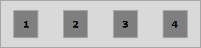
Flex-start示例
将这个值传递给属性 justify-content 时,flex-item将放置在集合的开头。
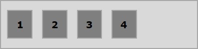
下面的示例演示将值flex-start传递到justify-content属性的输出。
<!doctype html>
<html lang="en">
   <style>
      .box1{background:green;}
      .box2{background:blue;}
      .box3{background:red;}
      .box4{background:magenta;}
      .box5{background:yellow;}
      .box6{background:pink;}

      .box{
         font-size:35px;
         padding:15px;
      }
      .container{
         display:flex;
         border:3px solid black;
         justify-content:flex-start;
      }
   </style>

   <body>
      <div class="container">
         <div class="box box1">One</div>
         <div class="box box2">two</div>
         <div class="box box3">three</div>
         <div class="box box4">four</div>
         <div class="box box5">five</div>
         <div class="box box6">six</div>
      </div>
   </body>
</html>
它将产生以下输出-
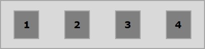
Flex-end示例
将这个值传递给属性 justify-content 时,flex-item将放置在集合的末尾。
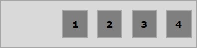
下面的示例演示将值flex-end传递到justify-content属性的输出。
<!doctype html>
<html lang="en">
   <style>
      .box1{background:green;}
      .box2{background:blue;}
      .box3{background:red;}
      .box4{background:magenta;}
      .box5{background:yellow;}
      .box6{background:pink;}

      .box{
         font-size:35px;
         padding:15px;
      }
      .container{
         display:flex;
         border:3px solid black;
         justify-content:flex-end;
      }
   </style>

   <body>
      <div class="container">
         <div class="box box1">One</div>
         <div class="box box2">two</div>
         <div class="box box3">three</div>
         <div class="box box4">four</div>
         <div class="box box5">five</div>
         <div class="box box6">six</div>
      </div>
   </body>
</html>
它将产生以下输出-
Center示例
在将此值传递给属性justify-content时,可伸缩项目将放置在集合的中心,多余的空间将在可伸缩项目的开始和结尾处平均分配。
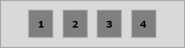
下面的示例演示将值中心传递给justify-content属性的输出。
<!doctype html>
<html lang="en">
   <style>
      .box1{background:green;}
      .box2{background:blue;}
      .box3{background:red;}
      .box4{background:magenta;}
      .box5{background:yellow;}
      .box6{background:pink;}

      .box{
         font-size:35px;
         padding:15px;
      }
      .container{
         display:flex;
         border:3px solid black;
         justify-content:center;
      }
   </style>

   <body>
      <div class="container">
         <div class="box box1">One</div>
         <div class="box box2">two</div>
         <div class="box box3">three</div>
         <div class="box box4">four</div>
         <div class="box box5">five</div>
         <div class="box box6">six</div>
      </div>
   </body>
</html>
它将产生以下输出-
Space-between示例
将此值传递给属性 justify-content 时,多余的空间将平均分配到flex项目之间,以使任意两个flex-items之间的空间都相同并且flex-物品接触集合的边缘。
下面的示例演示将之间的空格值传递给justify-content属性的输出。
<!doctype html>
<html lang="en">
   <style>
      .box1{background:green;}
      .box2{background:blue;}
      .box3{background:red;}
      .box4{background:magenta;}
      .box5{background:yellow;}
      .box6{background:pink;}

      .box{
         font-size:35px;
         padding:15px;
      }
      .container{
         display:flex;
         border:3px solid black;
         justify-content:space-between;
      }
   </style>

   <body>
      <div class="container">
         <div class="box box1">One</div>
         <div class="box box2">two</div>
         <div class="box box3">three</div>
         <div class="box box4">four</div>
         <div class="box box5">five</div>
         <div class="box box6">six</div>
      </div>
   </body>
</html>
它将产生以下输出-
Space-around示例
将此值传递给属性 justify-content 时,多余的空间将平均分配到各个flex-item之间,以使任意两个flex-item之间的空间相同。但是,集合的边缘与其内容物(flex-item的开始和结束)之间的空间是flex-item之间的空间的一半。
下面的示例演示将值space-around传递给justify-content属性的输出。
<!doctype html>
<html lang="en">
   <style>
      .box1{background:green;}
      .box2{background:blue;}
      .box3{background:red;}
      .box4{background:magenta;}
      .box5{background:yellow;}
      .box6{background:pink;}

      .box{
         font-size:35px;
         padding:15px;
      }
      .container{
         display:flex;
         border:3px solid black;
         justify-content:周围空间;
      }
   </style>

   <body>
      <div class="container">
         <div class="box box1">One</div>
         <div class="box box2">two</div>
         <div class="box box3">three</div>
         <div class="box box4">four</div>
         <div class="box box5">five</div>
         <div class="box box6">six</div>
      </div>
   </body>
</html>
它将产生以下输出-
Space-evenly示例
将此值传递给属性 justify-content 时,多余的空间将平均分配到各个flex-item之间,以使任意两个flex-item之间的空间相同(包括到边缘的空间) 。
下面的示例演示将值均匀地传递给justify-content属性的输出。
<!doctype html>
<html lang="en">
   <style>
      .box1{background:green;}
      .box2{background:blue;}
      .box3{background:red;}
      .box4{background:magenta;}
      .box5{background:yellow;}
      .box6{background:pink;}

      .box{
         font-size:35px;
         padding:15px;
      }
      .container{
         display:flex;
         border:3px solid black;
         justify-content:space-evenly;
      }
   </style>

   <body>
      <div class="container">
         <div class="box box1">One</div>
         <div class="box box2">two</div>
         <div class="box box3">three</div>
         <div class="box box4">four</div>
         <div class="box box5">five</div>
         <div class="box box6">six</div>
      </div>
   </body>
</html>
它将产生以下输出-
祝学习愉快!(内容编辑有误?请选中要编辑内容 -> 右键 -> 修改 -> 提交!)