- 入门教程
- 参考手册
 《Numpy入门教程》
 关注我们

NumPy - Matplotlib 直方图

NumPy具有numpy.histogram()函数,该函数是数据频率分布的图形表示,水平大小相等的矩形对应于称为bin的类区间,而可变高度则对应于频率。
numpy.histogram()
numpy.histogram()函数将输入数组和bin作为两个参数。bin数组中的连续元素充当每个bin的边界。
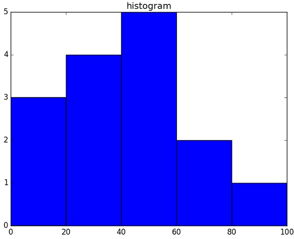
import numpy as np

a=np.array([22,87,5,43,56,73,55,54,11,20,51,5,79,31,27])
np.histogram(a,bins=[0,20,40,60,80,100])
hist,bins=np.histogram(a,bins=[0,20,40,60,80,100])
print hist
print bins
它将产生以下输出-
链接:https://www.learnfk.comhttps://www.learnfk.com/numpy/numpy-histogram-using-matplotlib.html
来源:LearnFk无涯教程网
[3 4 5 2 1]
[0 20 40 60 80 100]
plt()
Matplotlib可以将这种直方图的数字表示形式转换为图形。 pyplot子模块的 plt()函数将包含数据和bin数组的数组作为参数,并转换为直方图。
from matplotlib import pyplot as plt
import numpy as np

a=np.array([22,87,5,43,56,73,55,54,11,20,51,5,79,31,27])
plt.hist(a, bins=[0,20,40,60,80,100])
plt.title("histogram")
plt.show()
它应该产生以下输出-
祝学习愉快!(内容编辑有误?请选中要编辑内容 -> 右键 -> 修改 -> 提交!)
好记忆不如烂笔头。留下您的足迹吧 :)